
DTAC E-CARE
Case Study
How we designed dtac’s B2B payment platform to be more accessible and user-friendly.
Project Background
With nearly 20M subscribers, dtac is one of the largest wireless communication and mobile technology providers in Thailand. They already have a platform for SME and Enterprise customers to select mobile packages and manage accounts. But to offer digital end-to-end service, payment processing becomes one of the key features to create a seamless transition from offline to online.
OOZOU offered a design solution with a team of two designers and one project manager, and worked closely with the client’s business and development team. We worked one week sprints to deliver the User Experience wireframes and User Interface designs in rapid iterations.

Targeted customer segments
- SME with upto 200 numbers registered.
- Enterprise with multiple accounts and more than 200 mobile numbers registered.
Users
- Administrators or Accountants who needs to access billing information and documents for company financial purposes.
Pain Points
Difficult to track outstanding balance.
It is challenging to keep track of balances across a large set of diverse and complex SME and Enterprise accounts.
Managing billing records is time-consuming.
After recieving an invoice or paying bills, the users have to manage all the records by themselves. The more accounts the company has, the longer the time required to organize the documents.
Offline payment.
Bringing invoices to pay at a bank counter or Dtac counter service consumes time, especially when there’s a queue.

Scope of work
New Features
Deliver a design solution that allows users to easily pay their bills

Design Style Guide
Offer a user interface design that aligns with company’s branding and targeted customers

Responsive Design
Deliver a responsive design that is compatible with multiple devices - desktop, tablet, and mobile
How we work
Our goal: Design a responsive website for SME and Enterprise users to manage billing information, access transaction history and pay for their mobile packages
Ideate solutions
Ideate solutions to tackle the pain points. Prioritize the user stories for the minimum viable product release and ongoing development.
Create wireframes
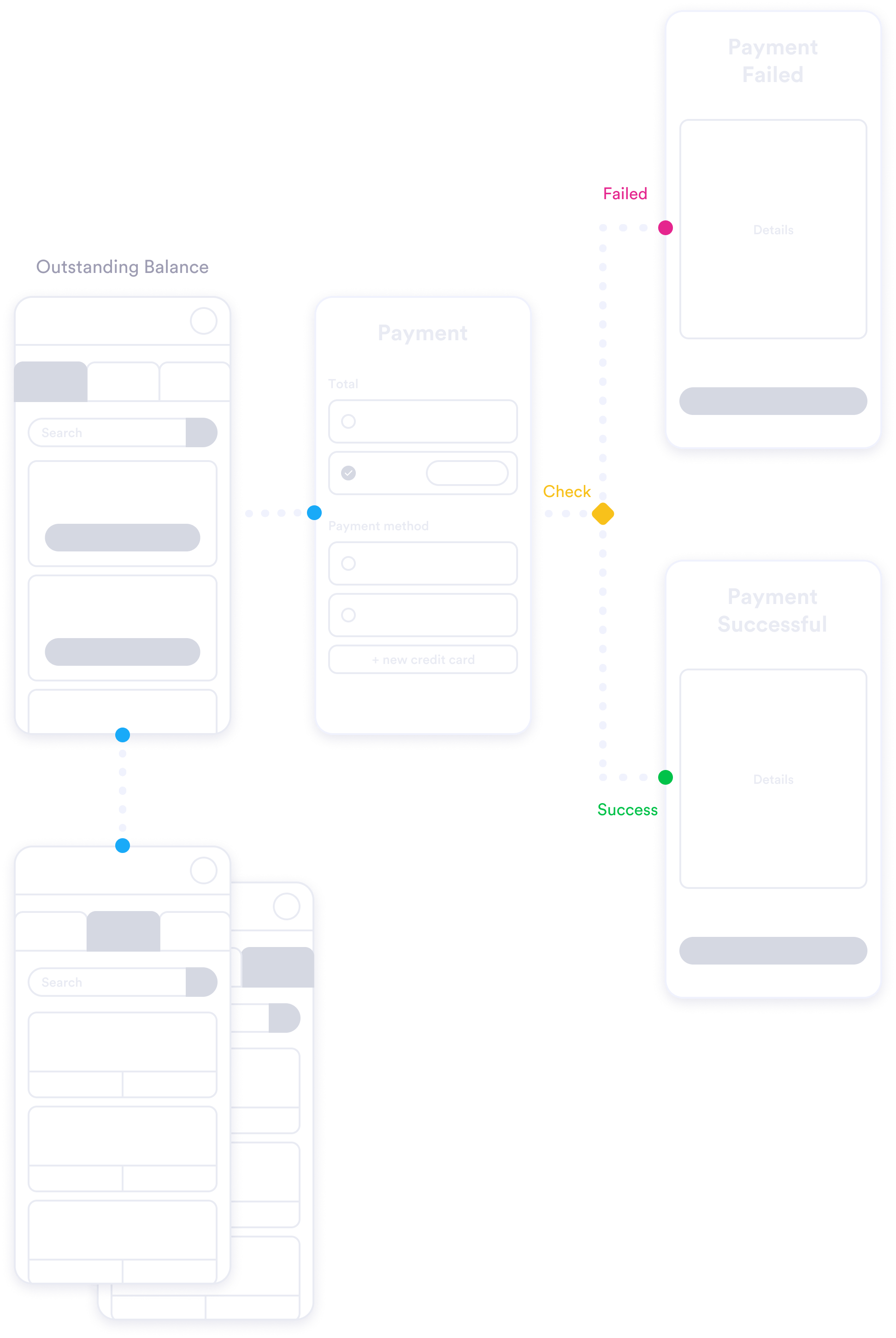
Create wireframes for the expected user experiences and review with the client and their development team. Identify technical limitations and iterate the designs.
Design demo
Demonstrate completed feature functionality design with the client.
Design user journey
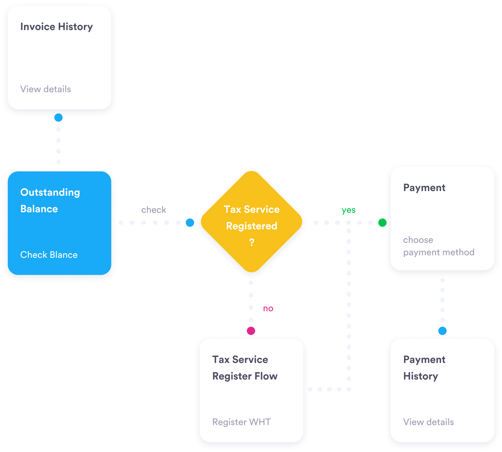
Design user journeys from checking an account balance to completing an online payment.
User interface designs
Develop the user interface designs for responsive web, reflecting company branding and the targeted users of the product.
Ideate solutions
Ideate solutions to tackle the pain points. Prioritize the user stories for the minimum viable product release and ongoing development.
Design user journey
Design user journeys from checking an account balance to completing an online payment.
Create wireframes
Create wireframes for the expected user experiences and review with the client and their development team. Identify technical limitations and iterate the designs.
User interface designs
Develop the user interface designs for responsive web, reflecting company branding and the targeted users of the product.
Design demo
Demonstrate completed feature functionality design with the client.
User Flows
Our goal: Design a responsive website for SME and Enterprise users to manage billing information, access transaction history and pay for their mobile packages
Wireframe Design
Create wireframes for the desired user experiences and review with the client and their development team.

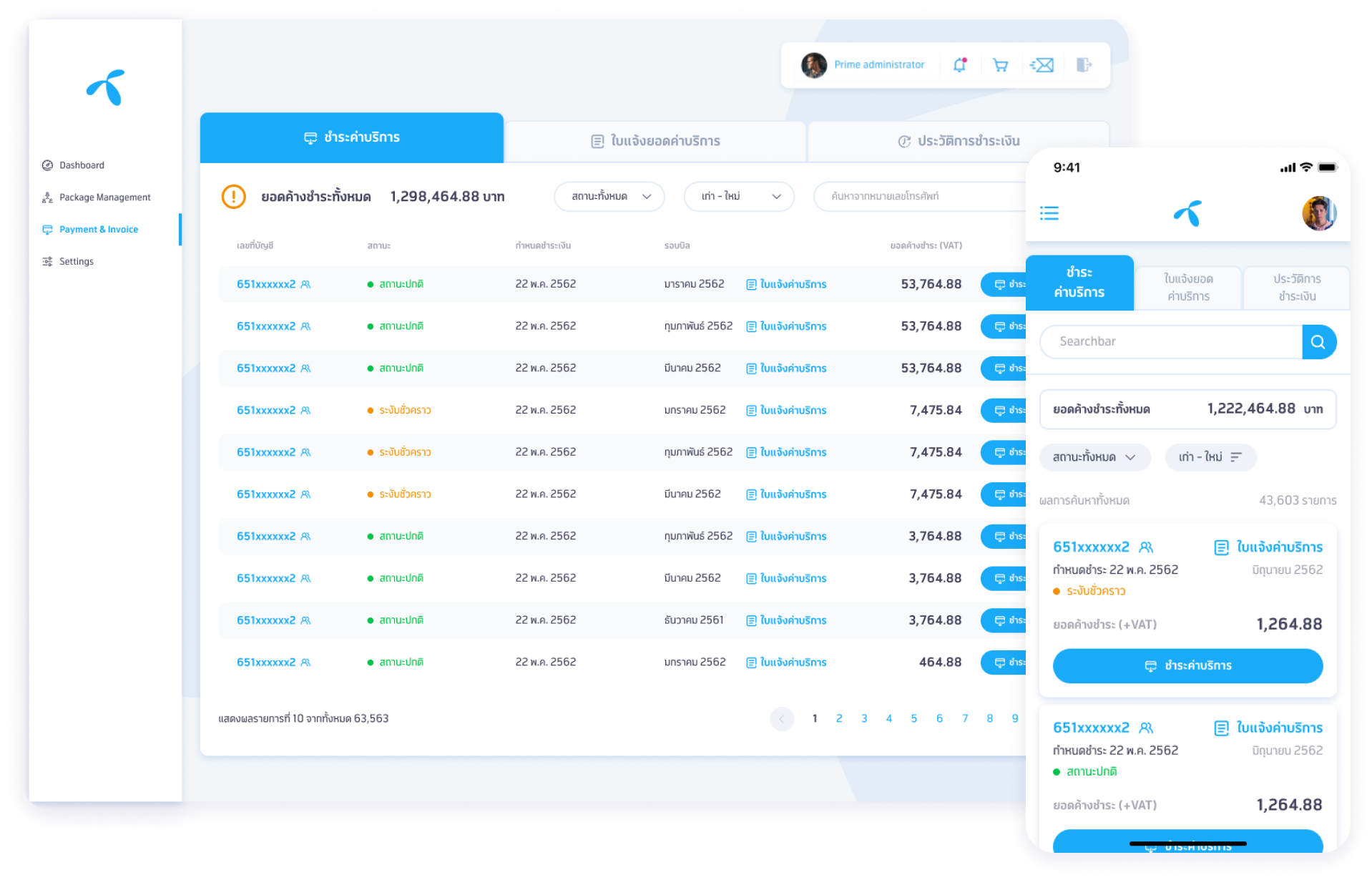
Visualization Design
Offer a user interface design that aligns with company’s branding and the targeted customers
Colors
#19AAF8
#E5258E
#F29000
#00C249
#41415B
Typography


User Interface design
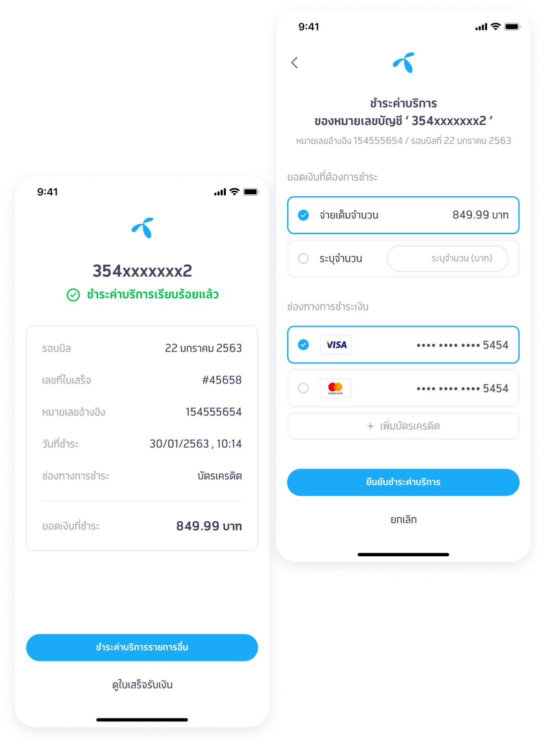
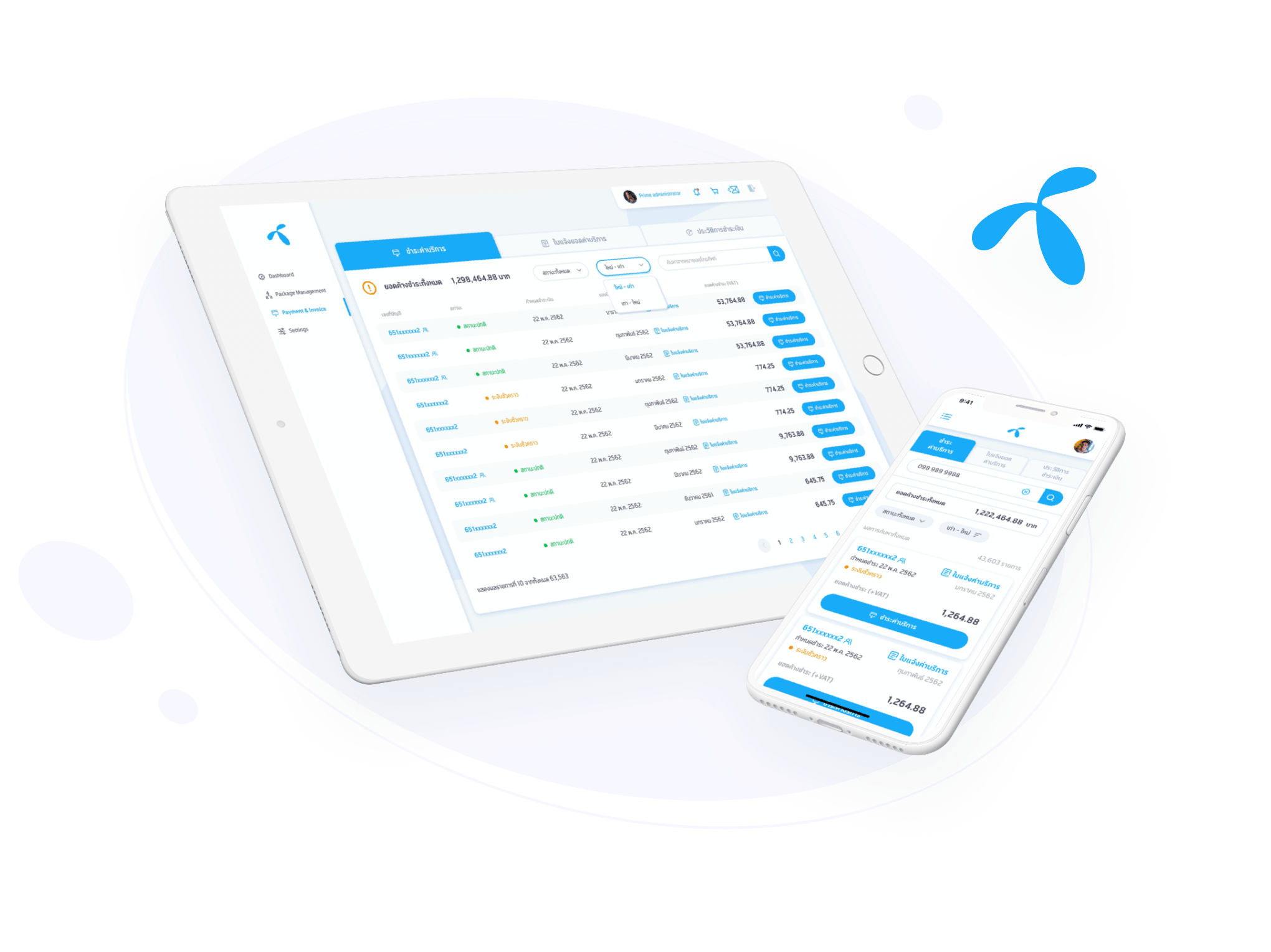
dtac wants OOZOU to design a platform to help B2B customers feel more comfortable with payment services and bill management. We have created this platform for accountants and administrators so they can check outstanding balance, view credit card payments, and browse payment history. This platform utilizes responsive web design for providing a user-friendly experience across all device types. Users can use it anytime, from anywhere.
We interviewed accountants to make sure we are presenting information in a format that fits their current workflows. By directly engaging the end users, we were able to design for an application that requires a much shorter learning curve.
Simplify how users check their balance
Checking documents one-by-one is a now a thing of the past. With our design, users can intuitively view outstanding balances in a familiar hierarchy.
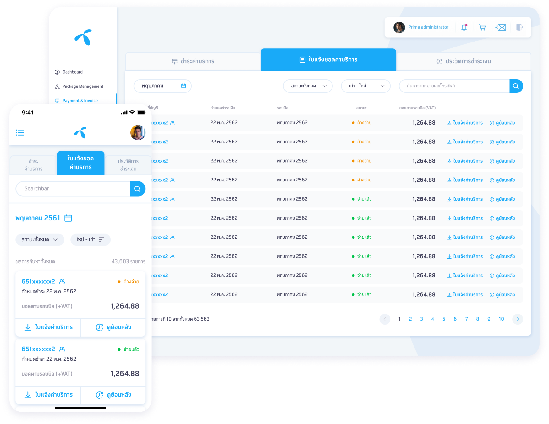
Management of all billing records
Manage receipts and bills more easily, and reduce the risk of document loss.
Easy Payment Services
Provides a simple online payment process to replace the inconvenient counter service and in-bank queues.
