How we brought one of the world's top hospitals to mobile
Bumrungrad International Hospital is one of the world’s top healthcare destinations. Each year over 1 million patients from 190 countries place their trust in this Bangkok-based medical institution.
To continue delighting their patients and promoting positive service experiences, here’s how we brought Bumrungrad International Hospital’s services to mobile.
Bumrungrad Hospital
UX, UI and Development
iOS and Android
Hospital services in the palm of your hand
Hospitals have always been an integral part of modern-day health and it has become increasingly important for their accessibility to the public. With 71% of the Thai population owning smart phones, it was clear to Bumrungrad that they needed to bring the services from their website to a more accessible native app for all.
To be able to connect with existing and potential patients outside of the hospital allows Bumrungrad to access and cater to patient needs. Moreover, the multiple services included in the app allow Bumrungrad to interact with users on a larger scale - both domestically and internationally.
Bumrungrad will then deliver a total digital solution and set up a one-stop digital healthcare ecosystem and health digitization for everyone.


Goals, objectives and scope of work
Bumrungrad’s project goal was to prove to the Executive Leadership Team that a carefully-crafted mobile app would provide the vehicle to disrupt the hospital industry by enabling their customers and patients to manage their most important interactions directly from their mobile devices. They would no longer be regimented to waiting in queues, listening to music on hold, or filling out page-after-page of paperwork.
Bumrungrad envisioned a few key areas for their initial product offering as proof of concept.
The critical features included:
Our approach to Bumrungrad’s app
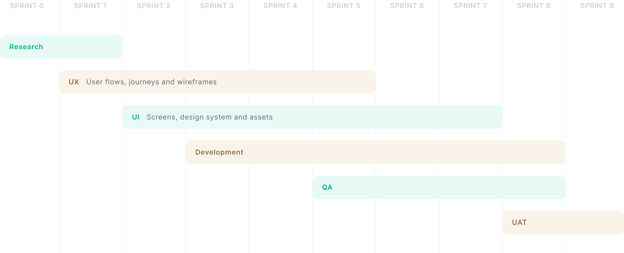
We began the project with an estimate of 6 sprints (about 3 months), but were granted an additional 2 sprints due to circumstances on the business side. Some features were deferred while others were added in.
Challenges, problems and our solutions
Like many complex projects, the Bumrungrad app was not without its challenges and obstacles.
Both UX and UI work was considerable as the MVP version of the app alone had more than 200 screens. Given that this was also a very short schedule, risk mitigation and fallback plans as well as several checkpoints were necessary to ensure that the desired functionality was included and value was delivered for the chosen MVP features without sacrificing quality or performance.

Keeping the team fully-engaged with each other and with the client were imperative to mitigate risk...
Getting the environment for mobile apps up and running was surprisingly difficult, due to lacking ADB2C and MSEL documentation and code examples. We held weekly calls with Microsoft Azure support to sort out problems. While some of these issues still exist, we were able to compensate and build successful temporary workarounds for them.
Other issues stemmed from the client’s backend system integration points not being fully-developed and available. However, we were able to work through the designated UAT time to complete the custom proxy service and successfully test, compressing the UAT to just a few days before its designated launch date.
Development
For the MVP phase of the project, we would build native mobile apps in Swift for iOS, and Kotlin for Android, while incorporating a NodeJS-based backend API proxy service to integrate with Microsoft Azure and several secure internal systems.
Initially, the conversation called for the mobile apps to directly interact with the various existing back office systems via their native APIs. However, the discovery process quickly revealed that a proxy approach would be much cleaner and add a layer of abstraction so that authorization, authentication, and session management could be more consistent across the wide variety of internal and external systems. It also afforded the team much greater flexibility in managing changes as much of the heavy lifting was moved to the NodeJS backend proxy and could be altered without needing to rebuild and deploy the mobile app.


Wireframes
As this was Bumrungrad’s first foray into building a mobile app, it was clear that it would be a design-led project. With several key features, our first step was to collaborate with Bumrungrad and establish the initial user journeys and wireframes.
Colour palette
Bumrungrad’s colour palette was integral to the app. We had to ensure that we adhered to their current corporate identity so that customers would be able to easily recognise the brand. The overall styling of the app was kept clean and legible with accents of the Bumrungrad green and gold.
Bumrungrad International
Our final design was based on multiple iterations throughout the UX and UI phase. We came to this end result by considering the pain points of current Bumrungrad patients while balancing it with the original goals and objectives.
Easy access to what you need the most
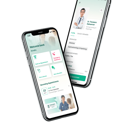
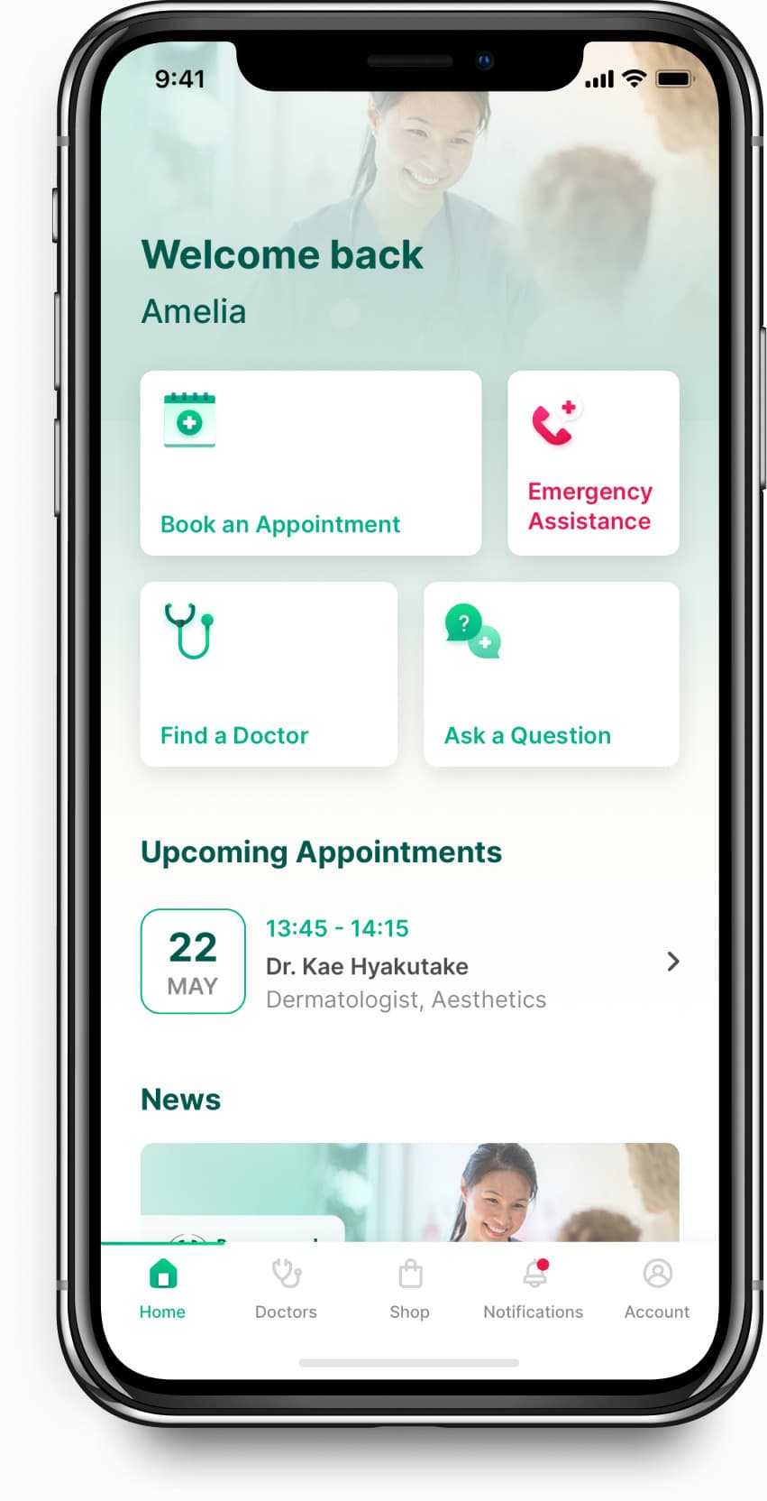
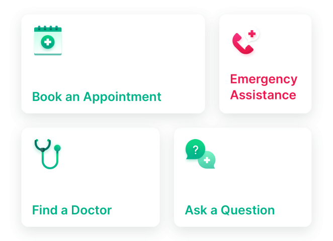
We wanted to make sure users could access the core features as easily and as quickly as possible. This is why we designed the Home UI to include four shortcuts; Book an Appointment, Emergency Assistance, Find a Doctor or Ask a Question.
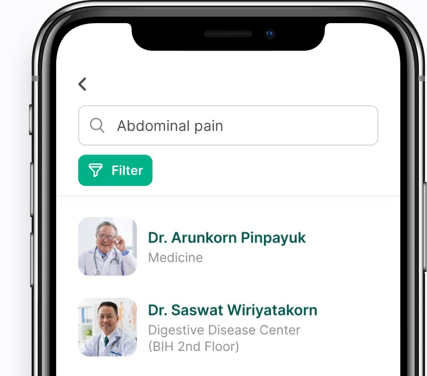
Discover and favourite doctors
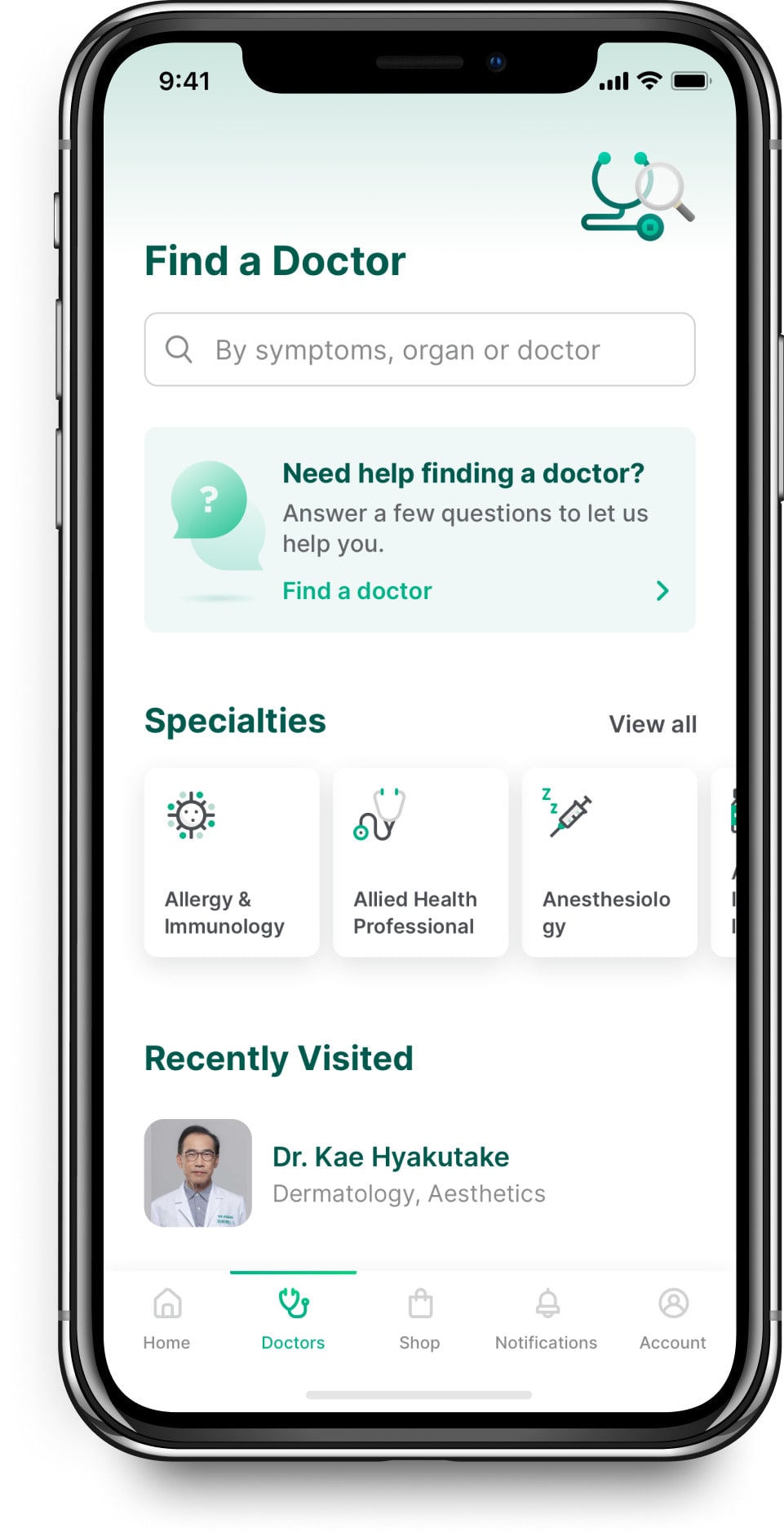
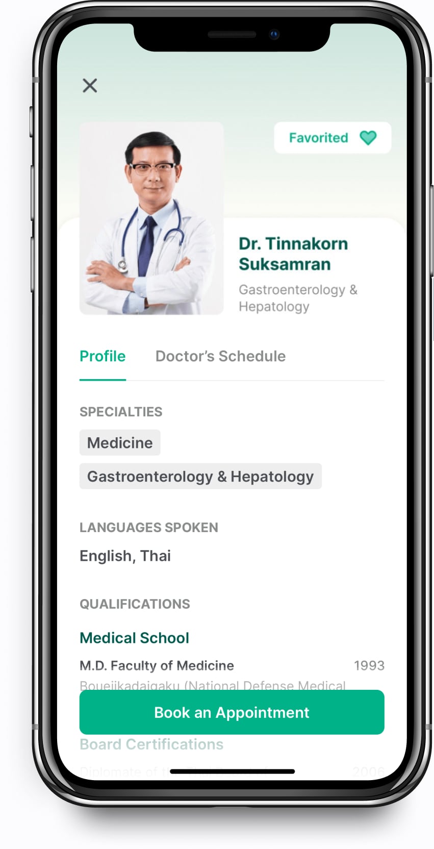
Browsing through doctors can be overwhelming which is why users must be able to easily find doctors - whether by searching for symptoms or looking through Bumrungrad’s specialties.
We developed an information hierarchy in the doctor's profile to improve scannability and understanding. Another feature added was the ability to favourite a doctor for quicker bookings and access.
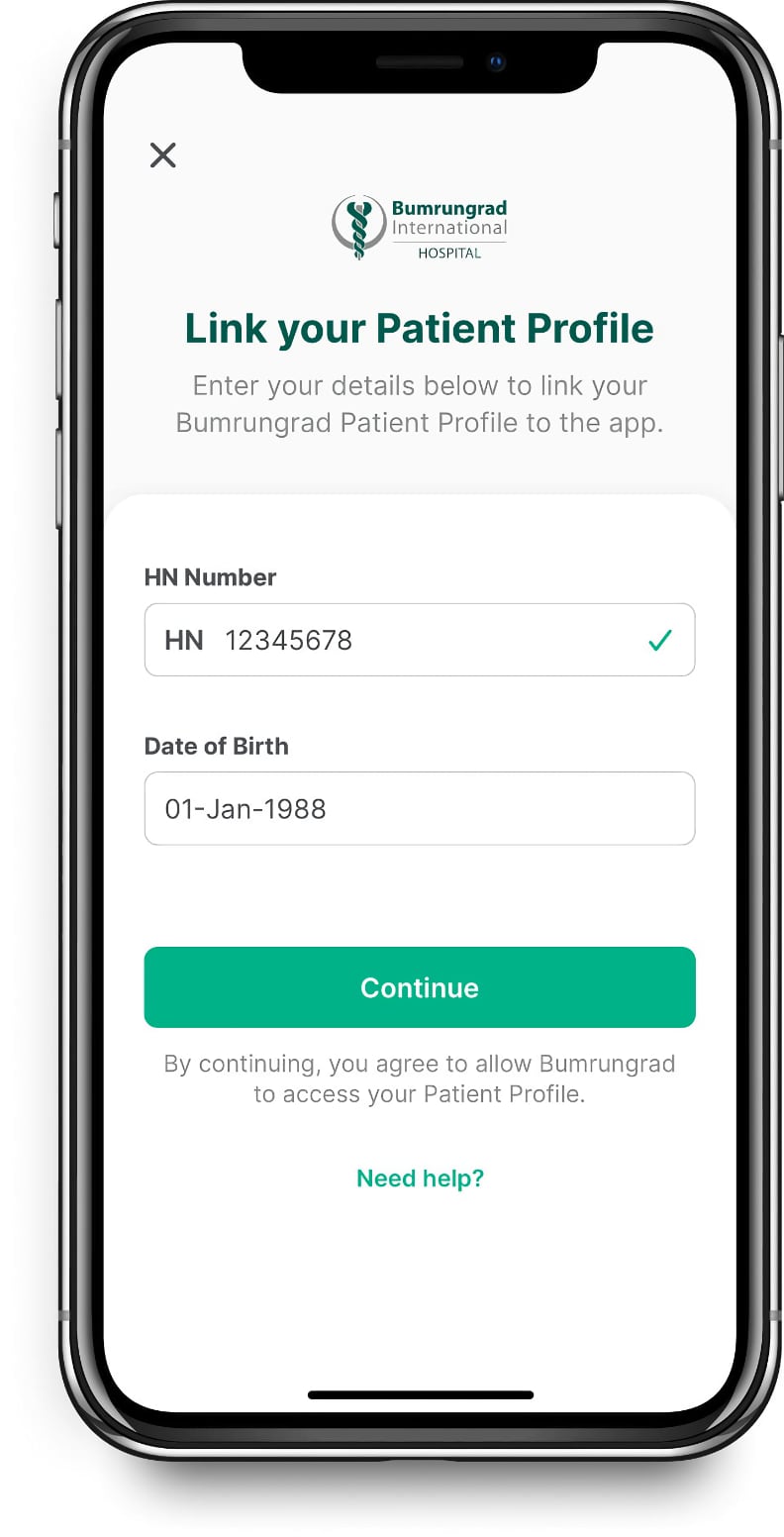
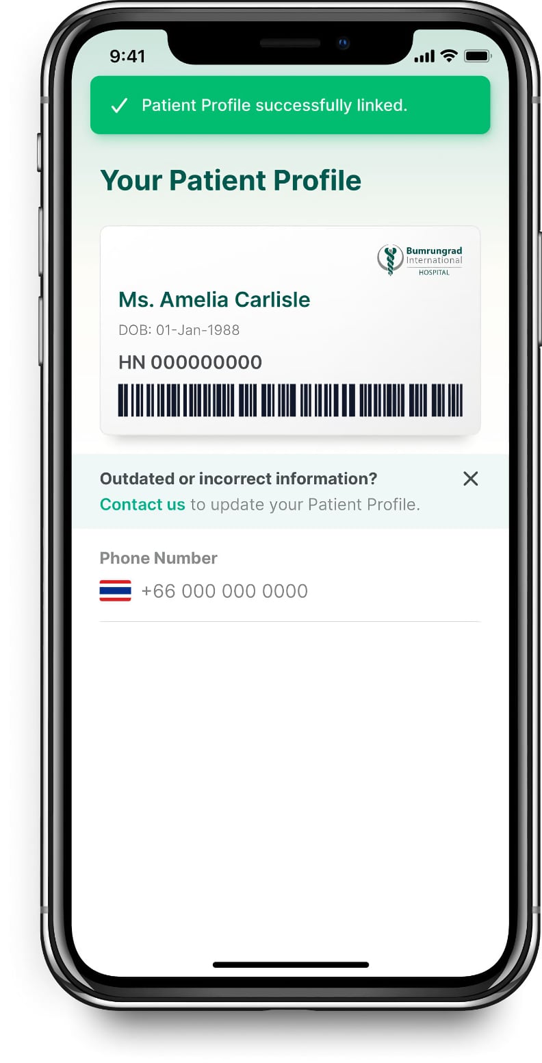
Link your hospital patient profile in just a few steps
Initially, it was impossible to link your patient profile to an online account. With our new design and infrastructure, users can easily link their Bumrungrad patient profile in just a few steps.
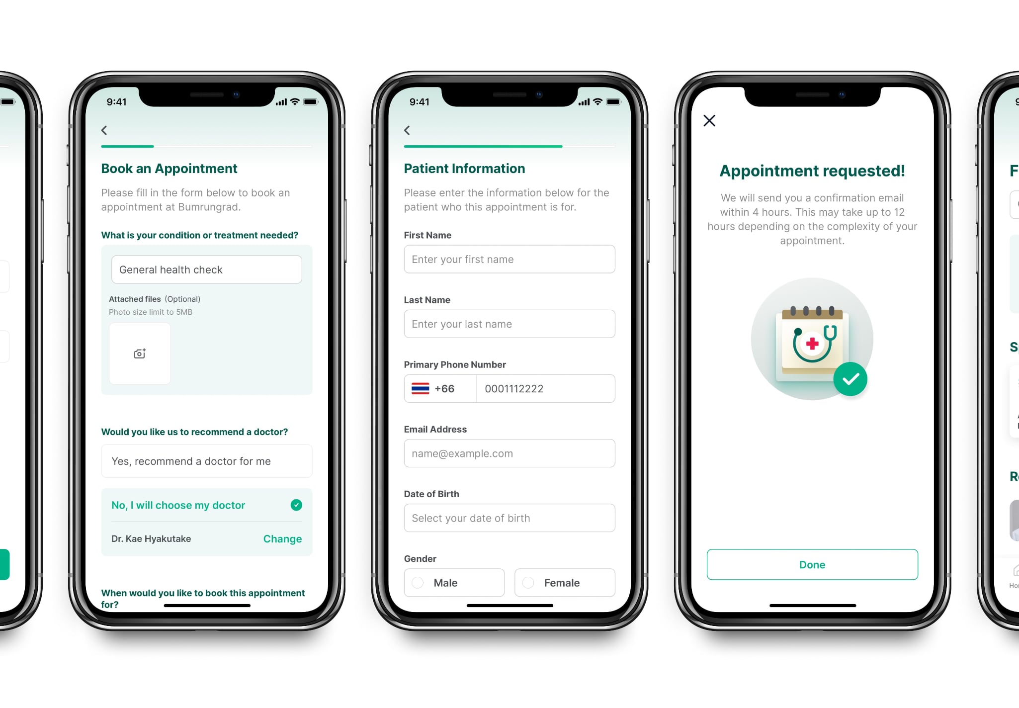
Finding the right doctor and booking an appointment is easy
It is a highly-common experience to be uncertain where to begin when it comes to health issues. What are the symptoms? What do they indicate? What type of doctor should diagnose us? The "Find a Doctor" feature was designed to be easily accessible from multiple sections of the app.
