Getting to know Mediums
Mediums aims to re-imagine the creative industry and the art supply as well as stationery scene to be accessible for everyone.

Mediums is a new 24-hour-creative landmark, selling a variety of products to support everyone’s creative needs. Mediums aims to be a to-go for artists, creatives and daydreamers of all types.
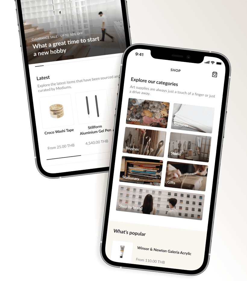
Mediums aims to re-imagine the creative industry and the art supply as well as stationery scene to be accessible for everyone.

Like many complex projects, the Medium app was not without its own challenges and obstacles.
Both UX and UI work was considerable as the MVP version of the app alone had more than 200 screens. Given that this was also a very short project, risk mitigation and fallback plans as well as several checkpoints were necessary to ensure that the desired functionality was included and value was delivered for the chosen MVP features without sacrificing quality or performance.
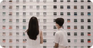
Keeping the team fully-engaged with each other and with the client were imperative to mitigate risk...
Mediums's project goal was to enable people to live a more sustainable lifestyle. The carefully-crafted mobile application would provide making art and design as open as possible. Enabling the customers to have the most frictionless experience right directly from their mobile devices. Mediums would use these online aspects to help shoppers better utilize their time to focus on creating rather than shopping.
Mediums envisioned a few key areas for their initial product offering as proof of concept. The critical feature included:
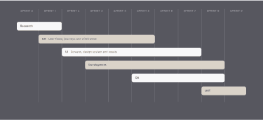
A design system is the single source of truth which groups all the elements that will allow the teams to design, realize and develop a product. So the design system is not a deliverable, but a set of deliverables.
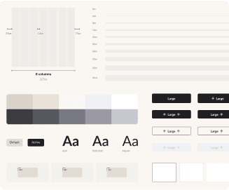
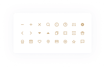
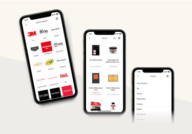
Mediums icons are designed to be simple, modern, and friendly. Each icon is reduced to its minimal form, expressing their essential characteristics.
For the MVP phase of the project, we would build native mobile apps in Swift for iOS, and Kotlin for Android, while incorporating a NodeJS-based backend API proxy service to integrate with Microsoft Azure and several secure internal systems.
Initially, the conversation called for the mobile apps to directly interact with the various existing back office systems via their native APIs. However, the discovery process quickly revealed that a proxy approach would be much cleaner and add a layer of abstraction so that authorization, authentication, and session management could be more consistent across the wide variety of internal and external systems. It also afforded the team much greater flexibility in managing changes as much of the heavy lifting was moved to the NodeJS backend proxy and could be altered without needing to rebuild and deploy the mobile app.
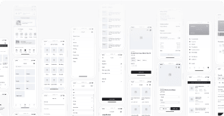
Firstly, we focused on wireframe. The wireframe is a diagram or a set of diagrams that consists of simple lines and shapes representing the skeleton of an user interface to focus on the core functionality.
Our final design was based on multiple iterations throughout the UX and UI phase. We came to this end result by utilising pain points of current Mediums customers as well as goals and objectives set initially.
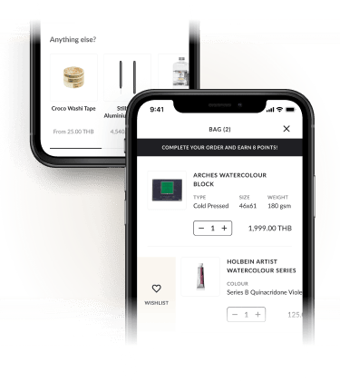
Optimizing shopping cart recommendations, the cross-selling tactic.
The end result of deploying cart page cross-sellers is bigger basket sizes. Additionally,customers can add products to the cart there and then, without the need to go through product pages, which minimizes the risk of them leaving the website.
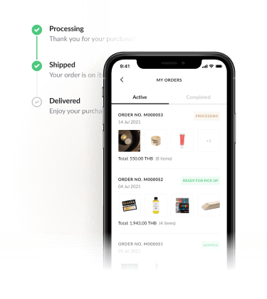
Showing where their order is in real-time with accurate information.
Real time order tracking can also affect brand loyalty, According to a survey study, 87.4% of respondents said that real-time order tracking made their buying experience more enjoyable and more likely to return.
We will get back to you quickly to answer your questions.
© 2026 OOZOU
Enjoy the rest of your day!