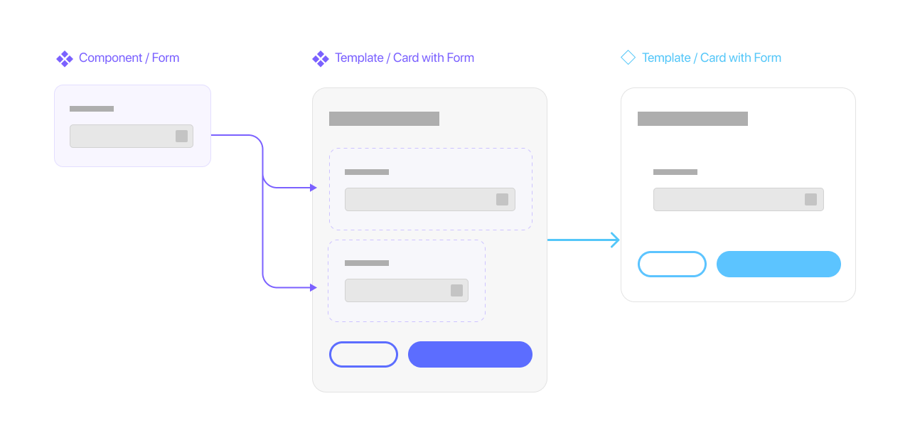
Mastering the art of dynamic auto-expanding components in Figma, especially within an auto layout frame, could be daunting. The way it works is a bit different and could hinder you from becoming the responsive god that you have always longed to be.
I won’t cover the basics here, though.
The most common issues usually stem from the misconception about how auto layout and constraints work in Figma. I won’t delve too deeply into the topic as there are many video tutorials (even from Figma itself) that explain it better than I am able to.
Knowing the difference is crucial for navigating through your work as a component-dweller. Here are handy vids that should get you up to speed quickly.
Knowing the difference is crucial for navigating through your work as a component-dweller. Here are handy vids that should get you up to speed quickly.
After you’re done, here are some simple tips that could help you survive in the world of responsive-ocalypse:
1. To frame or not to frame
I was often asked how frames and group work in Figma. I could give you a dead-simple explanation like this:
As far as our design process is concerned, a frame:
- IS for a container that you put an element into
- Has its fill and border colour (so preferably don't put any more colour-filled rectangle background behind it)
- Has its own bound and will be cropped if the content goes beyond it (like a mask object)
On the other hand, a group is for:
- Grouping (duh) multiple objects in order to move and resize them together
- And that’s it… really.
The definition might seem ambiguous - let me clarify it further.
2. Constraints and responsiveness

In responsive design, UI elements will need to be bound by their relative parent, meaning you would have to tell the component to stick to something if the size of the screen changes. This could be handled via enacting constraints within a frame (If you’re coming from Sketch/Illustrator - yes, what you previously called an artboard is also a frame here). This behaviour is inspired by the actual container a developer uses in their existing frontend code.
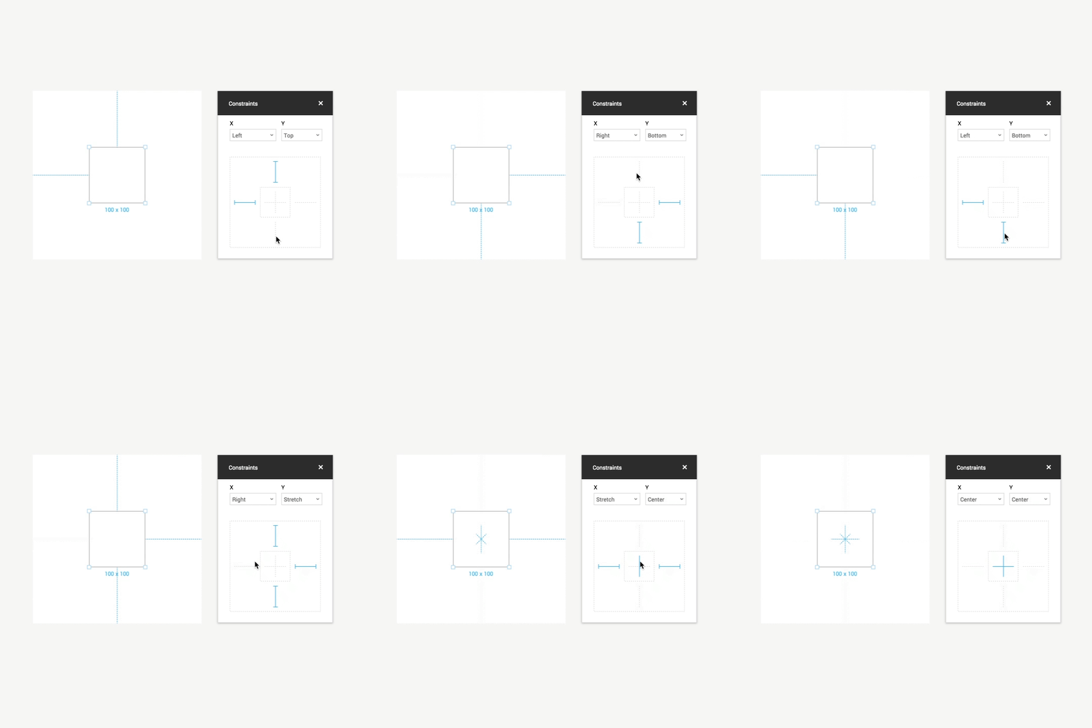
In Figma, a group would have :
- no constraints bound of its own and will stick to whatever parent’s frame it has resided in.
- no constraints bound of its own and will stick to whatever parent’s frame it has resided in.
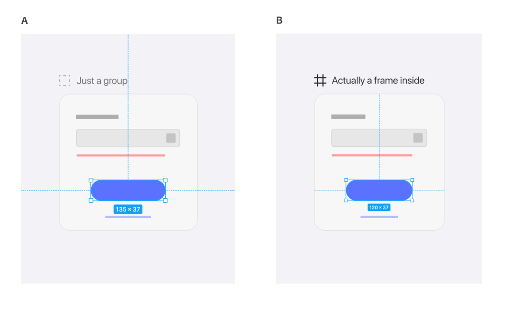
- Require an additional mask layer to actually mask its object, as opposed to Frame's ability to one-click masking, which results in a clean layer order:

It is not uncommon for a viewport to have frames within frames nesting inside each other. Think of it like a good-old photoshop cropping feature where your content will have a fixed bound to display its content.

Most of the options provided in Figma are created with developers in mind. So if you designed an element properly, it should convey the exact same behaviour you want throughout your prototyping screens without excessive explanation.
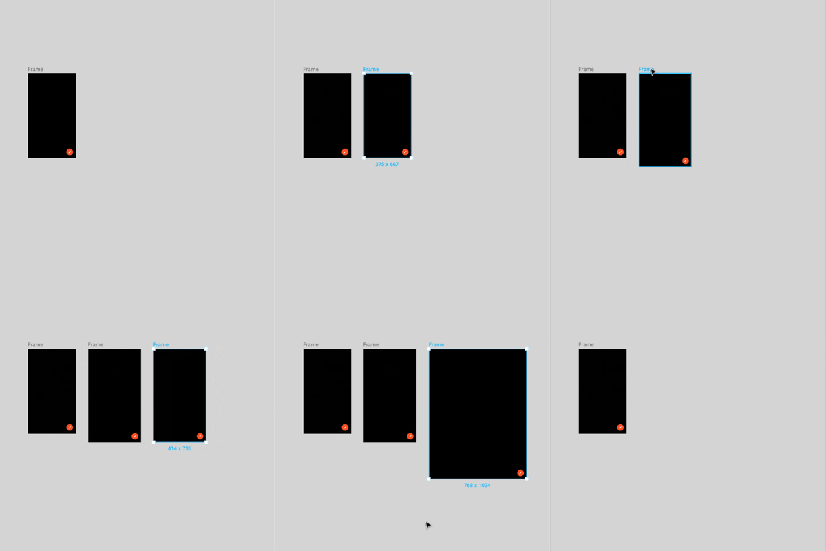
3. Auto Layout madness
Apart from having good flexibility among different screen sizes, having an auto layout that sorts itself within designated padding could mean a shorter time rearranging card after card for changes.

The problem is that in some instances, it doesn’t work well with a responsive design component. Why? Imagine having a single button component that expands itself according to the 16px padding and also expands itself to be full screen on mobile. Having an unclear rule on an element is a management nightmare for any design ops out there.


Looking for a new challenge? Join Our Team
In order to solve that, we decided to sublet a lot of ‘Auto layout objects’ and ‘Responsive objects’ together, resulting in a template model for both mobile and responsive frontend UI.
4. The new auto layout option is somewhat… weird
This article was written BEFORE (but published AFTER) the new Figma's auto layout update was released. Read more about it here
Ah, the little button that is comparable to that odd screwdriver of yours. It doesn’t belong anywhere in your toolbox, but good god does it make you feel like you’re missing something without it around.

It will pop up once you have set up an auto-layout residing in any frames or groups, accessible from the right sidebar. This little option will stretch your group/frame to fit the width of your Auto-layout object. You were causing everything in there to expand along with the newly adjusted bound (if something in there happens to be shrunk or expanded). This is when your constraints come into play. The better you set it up, the more appropriately it will behave under various dynamically-sized components.
Without the stretching option, the usefulness of the entire functionality could crumble. Yet the button itself feels so out of place you are dumbfounded. It has been hidden under your nose for so long. Like that weird but lovable member of the family, amirite?\
5. If you can’t do it, break it down then build it back up.
This might sound like I’m teaching you how to fix a washing machine. Trust me, it’s exactly how these 2 features work.
Most of my (and my colleague’s) frustrations usually originate from having a misunderstanding of how an object operates within a frame, or whether to set up constraints or auto-layout components the same way.
Suppose you hit the technical roadblock. It’s preferable to disassemble everything and start from each of the elements, e.g. Input field, Label, Error Text, Button, Icon then work your way back up to what it is. Create a dummy main component to define its constraints and behaviour. Then test those settings with an instance.
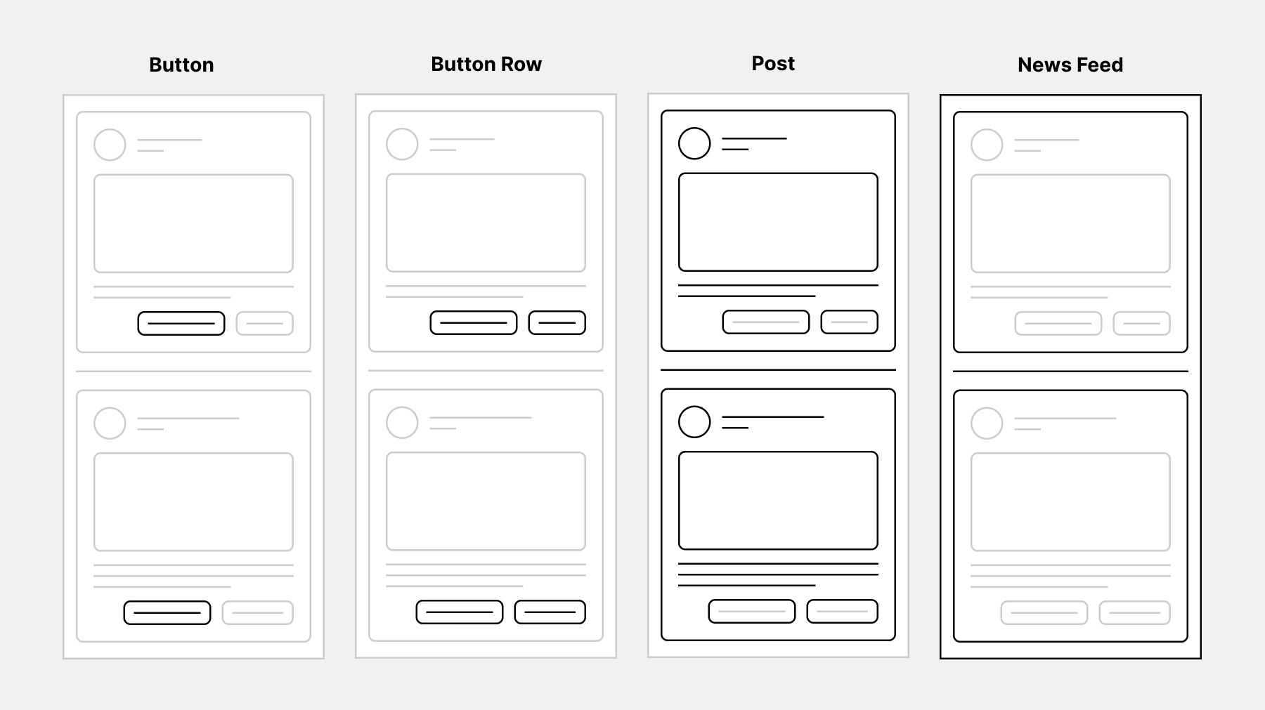
It was just a bunch of layers tied together, after all Remember to not ever, and I mean, NEVER, test your auto layout configurations with the main component directly. Some functionality will behave differently on an instance.
Remember that practice makes perfect. After a while, you should be able to see how a complex component behaves and how to modify its instance.
6. Conclusion
Mastering Auto Layout in Figma is like unlocking a superpower for designers who want to create responsive and adaptive designs. By getting a grip on the basics of Auto Layout and learning how to use it effectively, you can save a ton of time and streamline your workflow. Whether you’re crafting simple buttons or complex cards, Auto Layout offers a treasure trove of possibilities for you to explore.
By following the tips and examples outlined in this guide, you can elevate your skills and create designs that look great on any screen size or device. Whether you’re just starting out or you’re a seasoned pro, Auto Layout is a powerful tool that can help you achieve your design goals. So, dive in, start experimenting with Auto Layout today, and discover the endless possibilities it has to offer. Happy designing!

