Figma: Best Practices for Variants in Your Active Design System
We all love updates to our favourite design tools. However, getting it done in a reasonable timeline is another matter entirely.
Figma just released variants. An amped-up version of components override existed initially within most design tools, strengthening our vision of better design system practices more than ever before.
How can it be of use?
Confusing components, back and forth discussion or even outright design inconsistencies are causing friction between work tasks more than we care to admit. Here at OOZOU, we work in an environment that demands a quick turnaround and volatile design system for each active project. Organizing and naming all your components properly can significantly impact the management and creation of variants. Keeping the design system manageable and tidy is critical so that designers can bounce in and out of projects as needed. Using the asset panel, designers can easily browse, select, and modify components, enhancing the overall design process. Activating auto layout can optimize the arrangement and spacing of component variants, making it easier to manage and visualize designs. The variant, a predetermined set of components with customizable component properties, could go a long way to reducing unnecessary documentation.
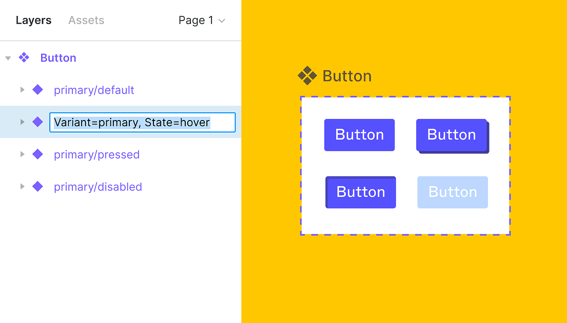
Start with micro-components
You can start by gradually converting any components used to build up an entire foundation of your system into variants. For example, UI elements like:
- Buttons
- Forms
- Tabs
- Navigation bar
- Dropdown menus
- And so on
For instance, a button component can have multiple variants for different sizes, types, and states.
could all be transformed to variants and provide better accessibility across the entire structure. Variants can preserve your override and get your newly-designed screens up and running without having to touch those messy layer lists within component instances.
Property of each component set can be completely customisable.
You can also add comments and attach the components link in case your frontend has a design system set up elsewhere. This could prove to be even handier when you’re dealing with a massive system and couldn’t seem to find anything without asking around first.
Using consistent layer names can simplify the process of configuring variants and maintaining a structured assets panel.
Uses documentation on main components to get others started quickly.
This approach allows for multiple variations of each component, enhancing flexibility and efficiency. You can easily add a new variant to an existing component set to accommodate different design needs. A single component can serve as the basis for multiple variants, each with different properties and states. For example, you can create two variants of a button component with different color properties. Variant properties allow you to define specific attributes for each variant, making it easier to manage and customize your components.
The downside of using variants
Creating variants takes time. Consider the workload before creating a set of variants. Oftentimes transitioning the override-able set of components into variants may seem a bit overkill from the start. However, as the project grows larger and you’re better-prepared to make a judgement of what should or shouldn’t be added into a set of components template, creating variants is indeed the way to go.