This is part 2 of the 3 Design workarounds series where we will be providing the principles of a solution implemented exclusively across our Figma-based projects. Most of these tips should work on Sketch (and even on an imported Sketch file). However, if you find some of these workarounds harder to figure out, feel free to reach me down in the comment section and we could discuss it more!
Redundancy is - well - boring

The main problem of our back-and-forth design feedback is that we change things all the time. And every iteration often results in all these tasks being carried out time and time again just so you can have ‘peace of mind’ at handoff. Sadly, you cannot eliminate regression checks altogether, but we can try to lighten the load by addressing the following usual suspects:
- Safely delete a Master component (on library file)
- Handle component maintenance time (using 2+ level override)
- Speed up your local file component manipulation
- Maintain different screen states (eg. error, success, empty, localisation, etc.)
1. Mark a master component as ‘Deprecated’ before deletion
In some circumstances, you might need to delete or switch out a Master component from a library. That seems to not be such a big deal... until you realise that every instance of said components will not be changed into the new ones you made. Sure, you have an option to restore it into a local master component, but that doesn't help much with your situation because you already created a shiny new component and the other one is not being used anymore.
Suddenly, you’re stuck squinting over each and every one of your previous design files just to switch out the old one.

Well, look no further! Thanks to this useful article from Steve Dennis we are now marking a master component in our library before deletion. By using an overlay of a bright coloured pattern to mark each item which saves us a lot of time when we need to ‘clean up’ whatever mess of a component we have when working in multiple features at once.
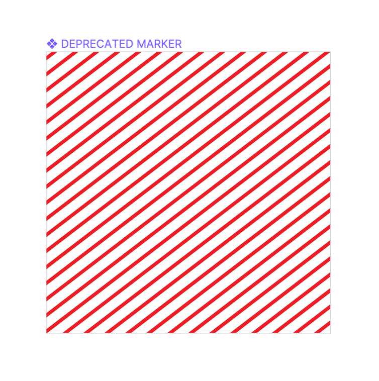
The idea behind this method is inspired by the concept of deprecated elements from the coding world. Marking an item as deprecated is like putting up a sign that says ‘if you’re seeing this in your design files, change it immediately’ and delete the master after getting an ‘all-clear’ from your team members.
Here is an example SVG file to get you started right away. Be sure to change it to a more ugly colour to leave an impression on your colleagues!
You can even rename the components itself so it's easier to find on the layer list just for good measure.
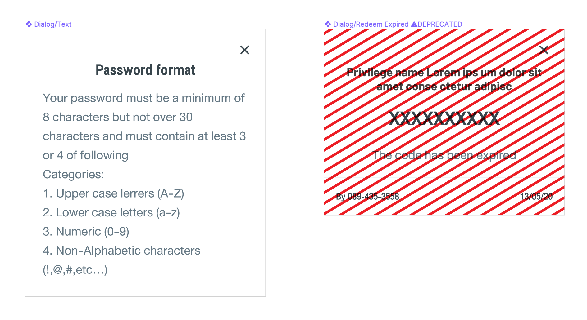
Our process for this workaround is to rename the target components beforehand. Then, when the cleanup task comes around in the current sprint, we unhide the deprecation mark and skim through all our screens. When we're done and have been given the green light from all team members, we go ahead and delete the masters. Easy-peasy!
2. Instance sheet (for system file)
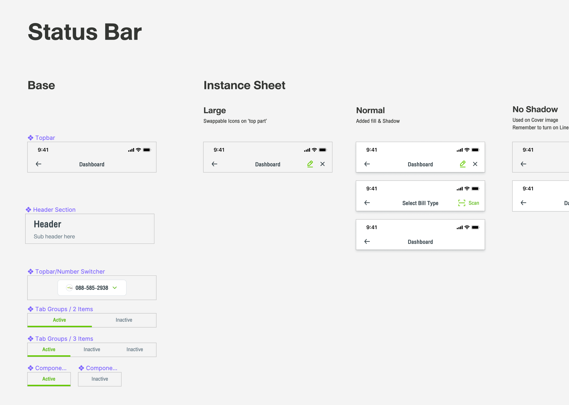
Imagine this: you created an elaborate piece of components with carefully-placed overrides for the system, only to find it changed after 2 weeks of usage. Would you create a new component consisting of 1-2 new elements you need just so it doesn’t break the old one? I have a better idea - build it on top of the old one and show what options you have when using it with override.
This offers us the flexibility we need while keeping the old component intact. While alerting others working on the same file of how you can tweak a component. They could even easily come into a library and copy-paste it into their file without having to reconfigure the master component locally.
Remember not to stack all 'option layers' together in a master component
Look, during a rushed project you might be tempted to not use the override feature of a component and instead go with 'putting different states as layers in a master component and toggle it on/off for each instance'. That is downright horrifying due to the fact that it becomes overwhelming over time. As a result, the 'proper' method itself will be harder to achieve the longer you procrastinate. I strongly recommend to clean it up as soon as they can, dividing each element into sub-components as soon as possible. Having a complex layer structure will be the downfall of civilized accessibility of your design system.
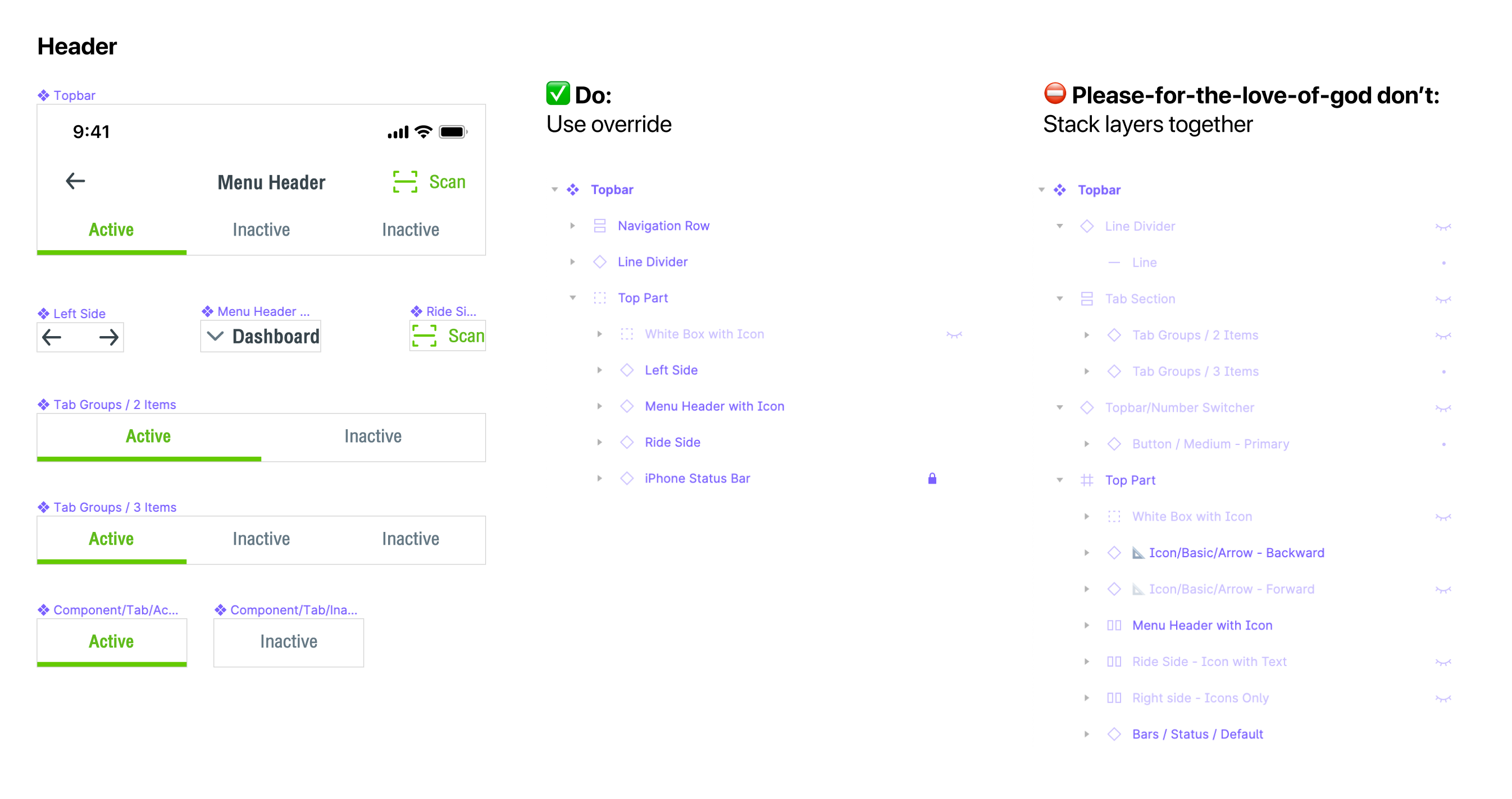
Normally (in our team) the ‘default’ state of the base component is most commonly used throughout the design. But if it happens to be built incorrectly the first time around, it’s better to leave it considering you might not have time to work on it yet. Consider marking unused layers as ‘DEPRECATED’ so any other member will notice and change it accordingly if they happen to be using it out of habit. This will help unclutter your components in the long run.
C. Nest your library component in your local working file
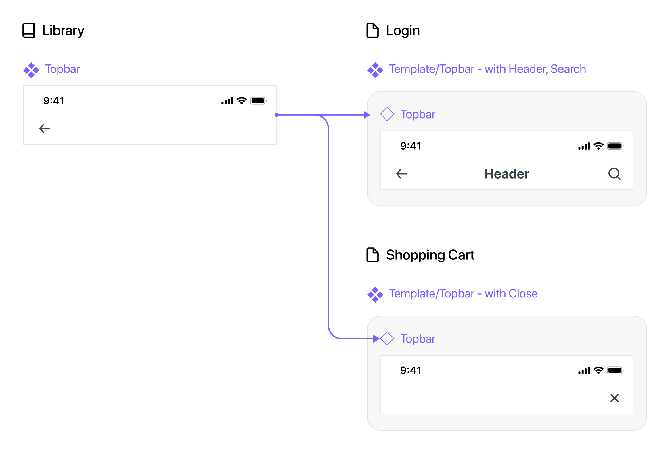
Continuing on the topic of master components overriding, if you’re short on time, try creating a frame of an already-overridden component and use it instead of the one from the master’s library.
With great flexibility comes great responsibility
Note that while this method saves time, it could get messy very quickly if you have no discipline in Figma overriding practice. (For example, you may end up with many components linking to multiple sources and not complying with library updates if you don't reset your styles override beforehand, etc.)
D. On-file template for quick screen state manipulation
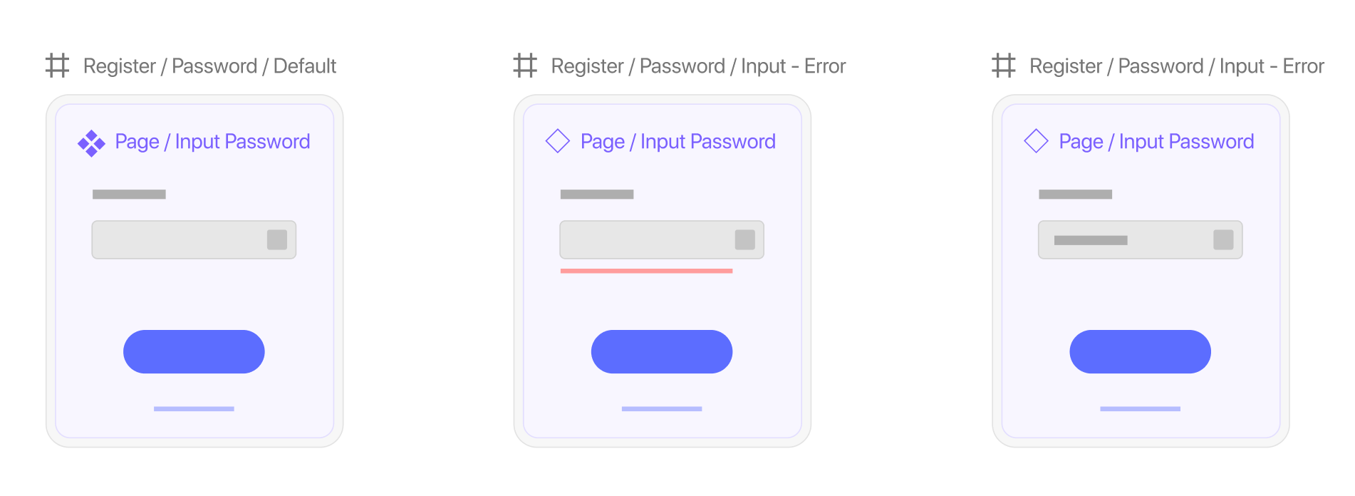
Some screens may require you to show multiple states consisting of small deltas against the original screen you designed. So you just carelessly copy and paste it multiple times. Yet when you received feedback from the client, you ended up fixing the padding of said element 4 times in a row because you haven’t set up a proper template screen for all of your available state design.
When you’re making an entire page as components for an override. Consider wrapping the page with another frame (or artboard) so you can retain its name to associate with other pages in the flow. You can then rename that master component inside to accommodate your component naming system like ‘Page/xxx’ or ‘Template/xxx’
This will help you distinguish local pages with your library components if you happen to name it similarly. More so, if you happen to be using another tool for getting reviews from stakeholders, this is probably a mandatory method (This is because most handoff tools like Overflow outright ignore uploading master components completely)
Hope this helps you on your quest (to relief boredom)

In thein the next part, we will be going through the process of stakeholders delivery methods while keeping Figma design files editable within your team.
