
This is part 1 of the 3 Design workarounds series where we will be sharing the principle of a solution implemented exclusively in our Figma-based projects. Most of these should work on Sketch (and even on an imported Sketch file). If some of these workarounds are tricky for you, hit me up in the comments and we can chat more!
So you have your design system up and running, nice work! I’m sorry to say but sooner or later you’ll be dealing with the annoying part of your design system - from simple “How many buttons can we put in a card item” to more complicated “How to delete a component without breaking others work” type of questions.
Don’t worry, we got you covered! (hopefully :P) These workarounds will make the experience more intuitive for the users.
Me flexing over my design op workout (with 98% less muscle than Mark)

Inconsistency in Design
Inconsistency in design means deviation from established patterns, norms or standards in a user interface. While consistency is often preached in the design industry, inconsistency can serve a purpose and even be beneficial in some cases. Imagine a perfectly consistent design—every button, every color, every font size is exactly the same. Sounds a bit boring, right? Inconsistency can be used to create an impression on new users, draw attention to specific elements and break up too much consistency. It’s like adding a splash of color to a black and white photo; it makes certain parts stand out and grabs attention.
The Effects of Inconsistency
Inconsistency can have positive and negative effects on the user experience. On one hand, inconsistency can cause confusion, frustration and disorientation. Imagine a user trying to navigate a website where every page looks different—madness! On the other hand, inconsistency can be used to create a unique brand identity, convey a brand’s message and values and make specific features or buttons stand out. It’s all about balance. When used wisely, inconsistency can highlight important elements and guide the user’s attention where it’s needed most.
Inconsistency in UX design is a big problem
The main issue in our working team is that we often don’t have a common understanding on how to apply these mutual rules in the project including:
- Spacing
- Text sizes
- Colours
In an ideal world, all these can be documented in a set of documentation. But at the start of the project, no one has time to maintain the integrity of our writings. So we end up with inconsistencies between designers who have to ask around for ‘that particular padding amount/text size/colour shades’ to use. These inconsistencies make it hard for users to navigate and use the design. If you don’t have the same ‘sweet spot’ between elements in your team. Here’s what I can offer:
A. For spacing issues, use the magic ‘spacer’
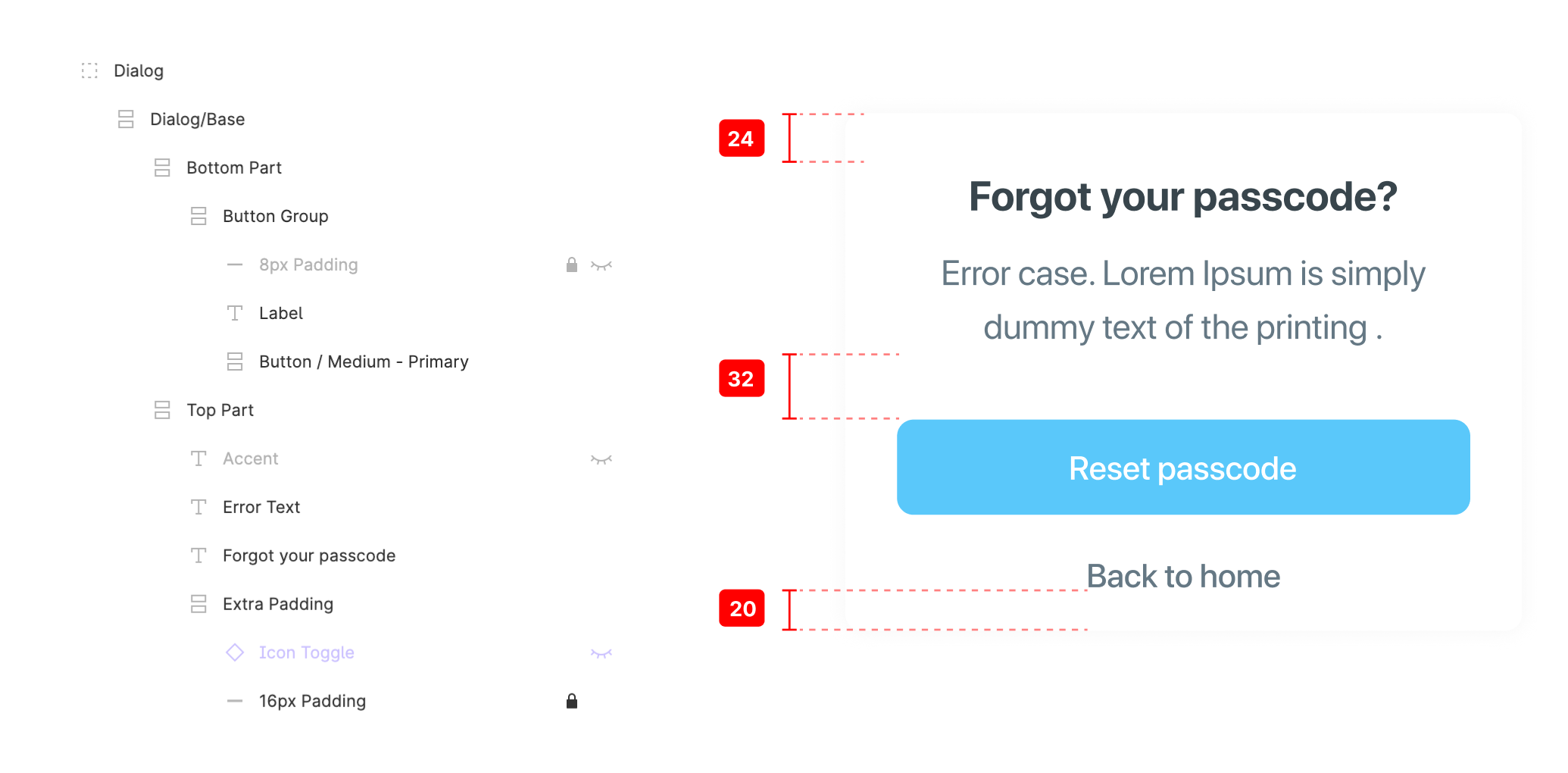
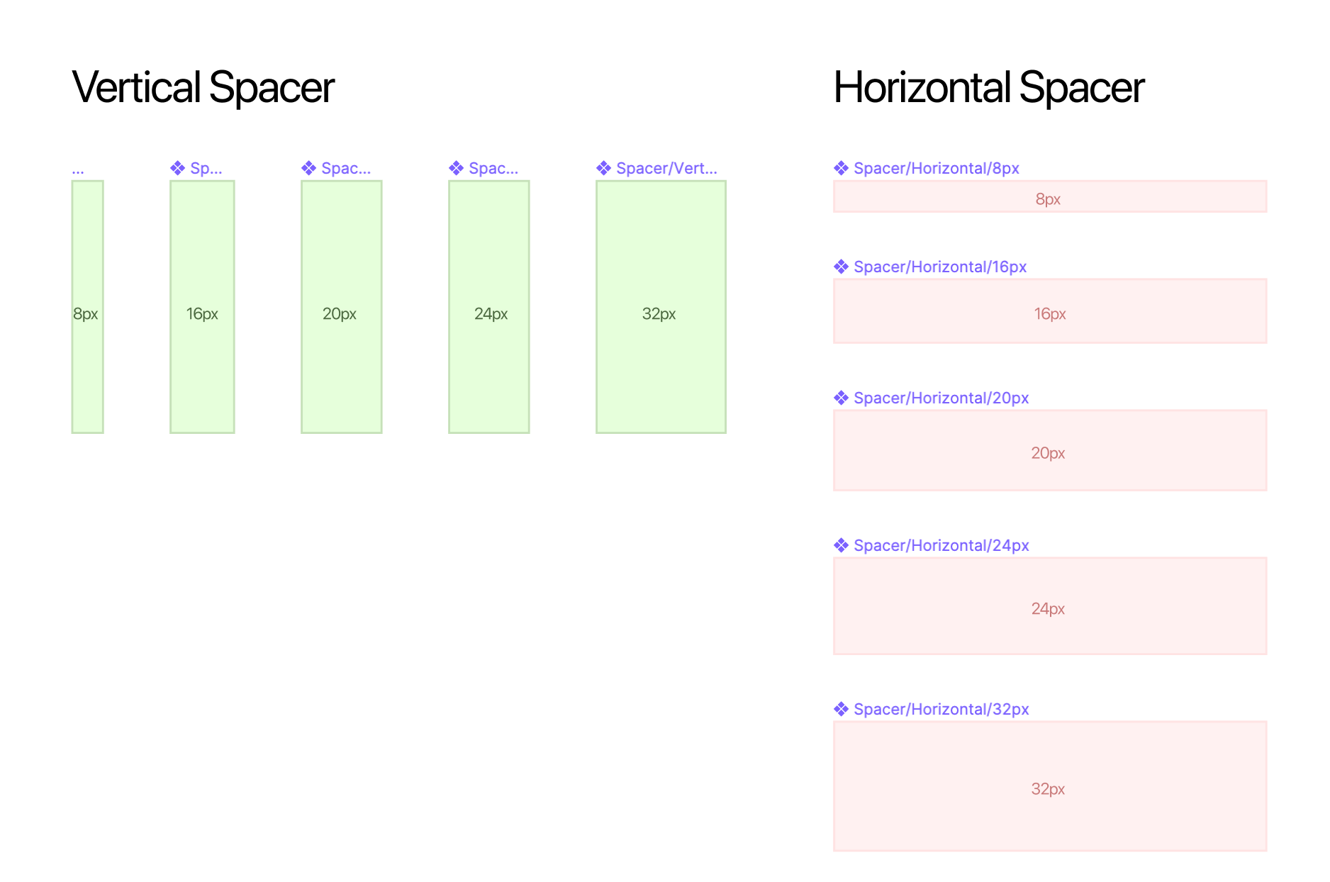
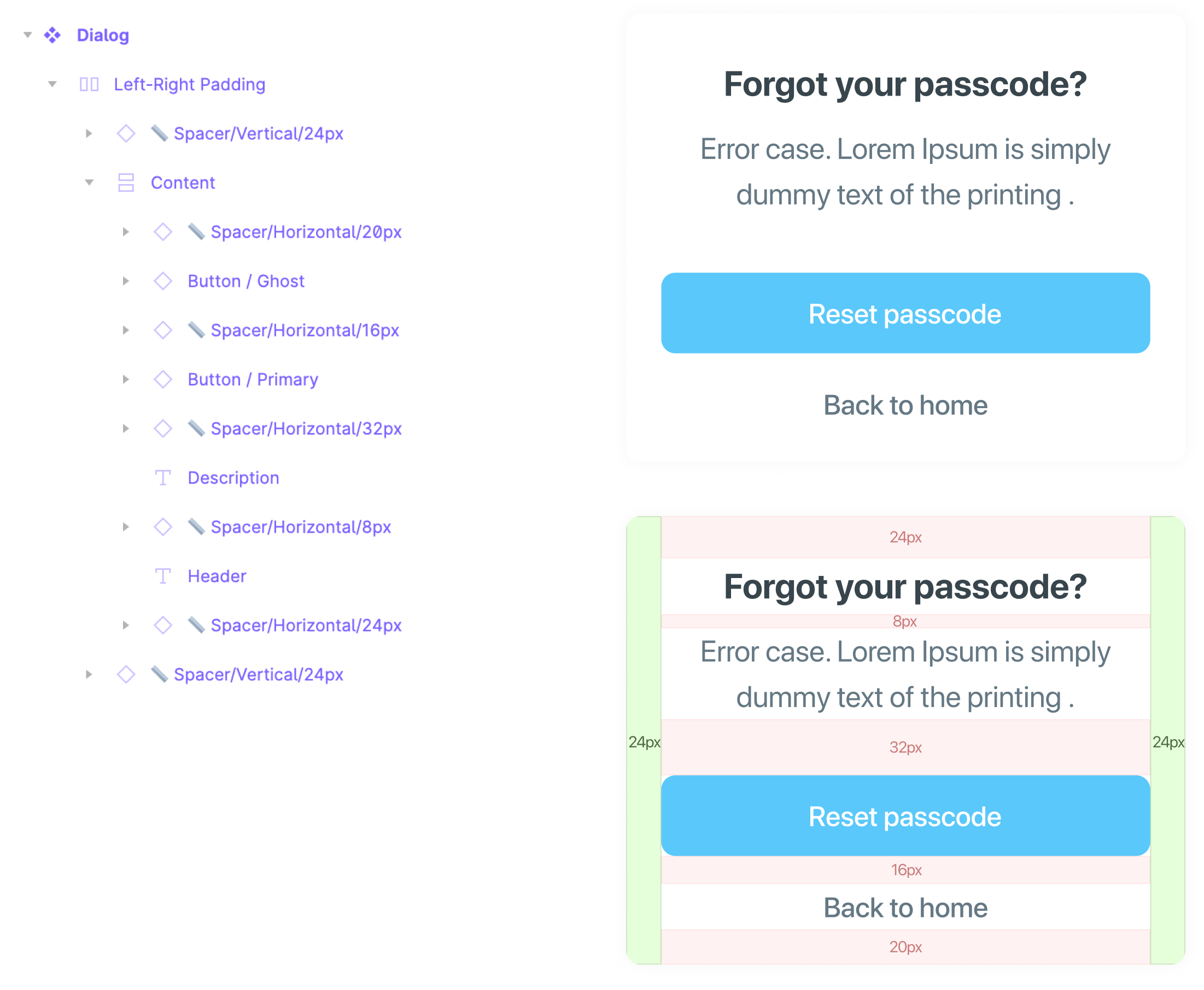
Figma and Sketch both have an Auto-layout (Smart layout) feature that can rearrange and increase object bounding box for you. But the method involves a more complex layer structure the more you want to customise the padding between objects. And don’t say you’ve never done this and ended up with 16px padding per object in your components. Doing so will make your design look as boring and repetitive as your kindergarten PE class! (unless you have an athlete physique and pursued a sports career since birth) So thanks to this workaround, we’re eliminating the process of clicking through each layout hotspot and memorising the number by creating a set of master components with a physical ‘padding’. Proper spacing is a crucial part of UX design that improves usability and user satisfaction.
Group these together to toggle visibility for ALL measurement components at once
This way we can compose each part of the system elements while maintaining the spacing between objects. (‘we keep it as 0 for all objects using Auto-Layout’) The advantage of this is that any designer working on the file can toggle ‘visibility’ of all spacer components to study the spacing rules on each element. Side note: This workaround takes some time to get used to so don’t do it mindlessly. At the beginning where your design idea is not yet well-formed will be harder to duplicate spacer objects than just to put a number in an Auto-layout’s property. Consider switching out traditional padding methods after your team has established a tangible ruleset on these.
Side note: This workaround takes a bit of work to get used to so don't enforce mindlessly. At the beginning where your design idea is not yet well-formed will be harder to duplicate spacer objects than just to put a number in an Auto-layout’s property. Consider switching out traditional padding methods after your team has established a tangible ruleset on these.
B. Text sizing issue: helper descriptions
If you’re building a system out of some UI kits (or with a dedicated design op person), you will probably see this kind of font set at the start of your system.
A helpful tip would be to delete some of those you haven’t used. If unfortunately you don’t have time for that, you’ll probably keep 3-4 levels of unused text size in the system for the sake of ‘overcompensating’ in case you ever need to have ‘a little bit smaller/larger’ size in your system. Do you really need to memorise how to use them for yourself (and everyone else)? Proper text sizing is a basic part of UX design that improves readability and user engagement.
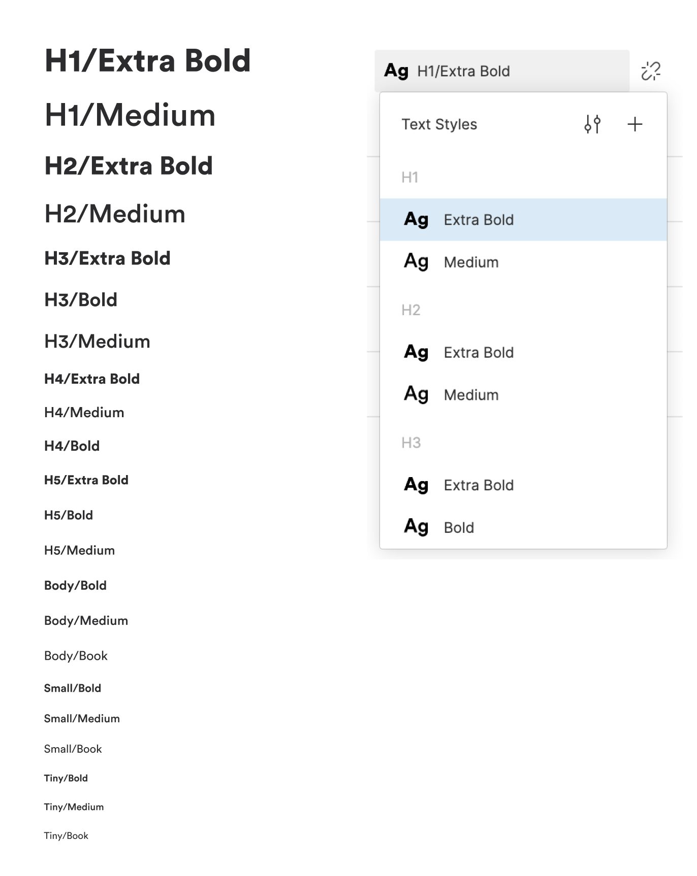
Create a group for elements you use frequently
And assign these to our work. This helps others so much when they’re reviewing our past work and helps users to understand and navigate the design better, to see how we distribute text sizing across the design.
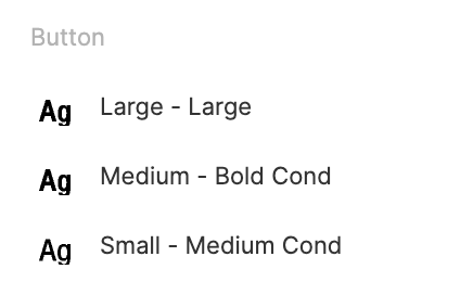
And assign these correctly within our work. This assists others immensely when they are inspecting our previous work and helps them assimilate how we distribute sizing of text across our design.
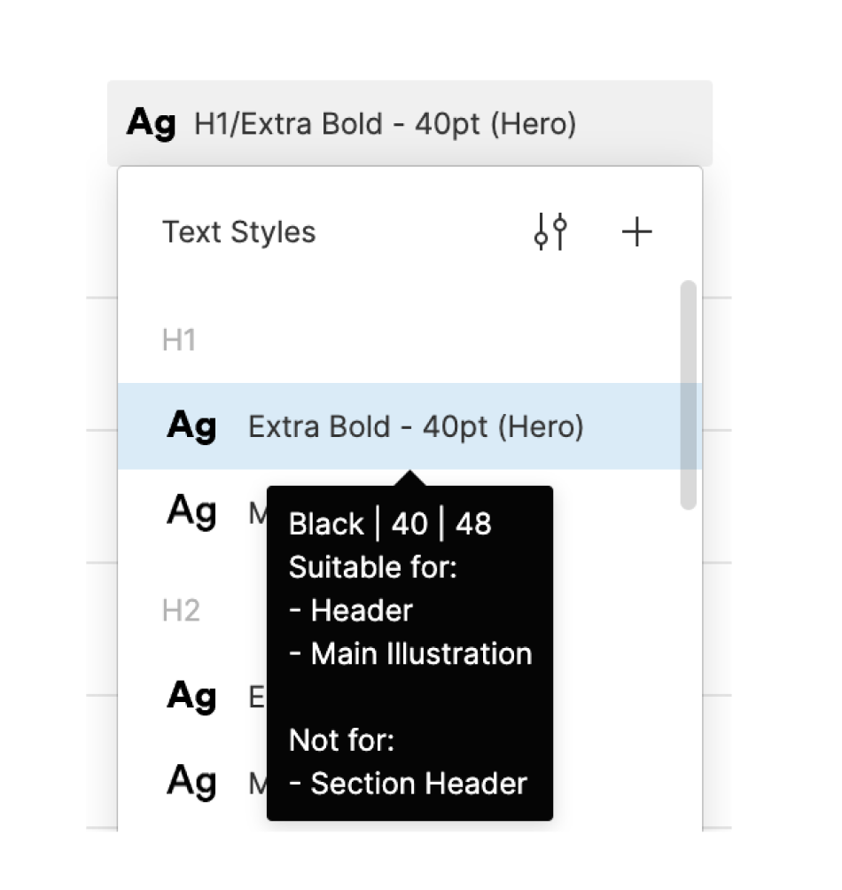
Or, put in descriptive tooltips for the user.
Alternatively, another way to help others to use these text styles correctly is to put useful info in your style description itself! Descriptive tooltips can help the user understand and use the text styles.
For those of you who scream “What if I have to change it often!?’ – hear me out. You’re not doing this as often as you think. Once you’ve delivered a feature or two. Changing those parts of a text style should be a BIG DEAL and not something to be fiddled around with by you or your clients every couple of days. A system should be, first and foremost, a time-saver for managing inconsistencies. Faster customization should come second, not the other way around.
C. Colour issue: the above applies to colour styles as well
You may already have 34 colour shades for different states of your buttons and forms in your style guide file. You or your colleague will get confused at some point and misuse your carefully-crafted grey and you will have to go through each file to spot the wrong colour every time you hand off a file. This problem is even more relevant if you have a ‘thin’ line icon for your system and it appears to look ‘lighter’ than the text next to it. Resulting in a mess where you tell everyone, ‘Please use Green 400 for all icons if you’re using Green 300 for text’ and they end up choosing the wrong colour style anyway. (Based on a true story)
How do you even choose?
A dead-simple solution to this is to create a ‘group’ of colour based on any specific part of the UI and have everyone stick to it.
Yes, you can still have the same ‘Purple’ for your Icons, Text, Button, Forms or whatever UI there is. It all should be separated and grouped together based on their relative uses as many times as necessary.
This might sound like it would require more maintenance if you ever come back and change later, but it’s not that time consuming and is pretty accessible to everyone in general.

A dead-simple solution to this is also to create a ‘group’ of colour based on any specific part of the UI and have everyone stick with it.

Yes, you can still have the same ‘Purple’ for your Icons, Text, Button, Forms or whatever UI there is. It all should be separated and grouped together based on their relative uses as many times as necessary.
This may sound like it would require higher maintenance if you happen to come back and tinker later, but it is not that time-consuming and is pretty accessible by everyone in general.
This may sound like it would require higher maintenance if you happen to come back and tinker later, but it is not that time-consuming and is pretty accessible by everyone in general.
Consistent User Experience
Consistency is key to reducing cognitive load and increasing efficiency. Consistency in user interface design helps users understand and navigate the interface, reduces errors and forms habits. Think of it as laying down a familiar path in a forest; users know where to go without getting lost. To create a consistent user experience, designers should focus on consistent elements such as typography, colour schemes and layout. But don’t be afraid to use inconsistency sparingly and in moderation. A well placed deviation can make your design more interesting and user friendly.
Conclusion
Inconsistency in design is not bad, and consistency is not the only measure of good design. A balance between consistency and inconsistency is required in design. Designers should focus on designing a system that meets user needs, not just consistency. By understanding inconsistency and using it well, designers can create a unique and memorable user experience that sets them apart from the rest. So, go ahead and have a bit of chaos, but keep it contained – your users will thank you for it!
That's it for now
Coming up in Part II, we will be going through how to reduce Redundancy occurring from high-maintenance design system workflows.