Image size (in px format and so on) doesn’t matter much when it comes to vector-based design tools because most of your elements in there aren’t actually pixel dependent. Instead, you can use a resolution scale to calculate and adjust visual resolutions for images and videos, ensuring the aspect ratio is maintained while resizing.
When we designers are talking about ‘resolution’ we basically mean the number of pixels lining up on a screen. Having more pixels should mean we’re getting sharper images, right?
These and many, many more...
A Never-ending Fragmentation War
The resolution of modern screens varies significantly due to different sizes and shapes, resulting in a different ‘density’ between devices. If you’re curious about how phone manufacturers deal with devices and screen fragmentation, check out Android and iOS developer documentation.
Noteworthy Measurement Units
The concepts of implementation with variable resolution and the scaling can be divided into 3 groups
1. Responsive website, PWA, Web apps, Platform with CSS
The developers would typically communicate to designers using px and various forms of a percentage (%) as a reference point. There may be some talk of relative length units like em or rem to some degree.
2. Android
Using dp(Density-independent Pixels) and sp(Scale-independent Pixels)
3. iOS App
Expect a points and px unit to dictate its relationship to various objects on the screen. Rendering at a lower resolution can lead to improved performance, although at the cost of UI clarity.
TLDR; Stick to the pre-made screen preset
Fortunately, if you’re working with commonly-used smart devices on the market. It is now pretty simple to follow whatever sizing your tools provide - It even shows you the actual sizes on the screen for reference.
The usual suspects are all here and ready to use.
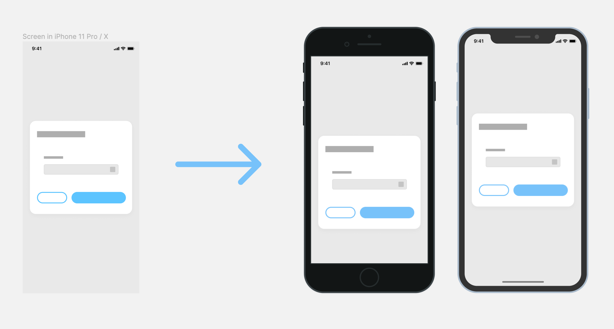
However, when working with weirdly-sized devices, you might discover that your design preview (on the actual device’s screen) is a bit distorted. This is because in design tools like Figma, the frame is enlarged to fit the screen you’ve previewed it with, which is NOT how these devices will be implemented in production. This can result in the image appearing stretched or compressed, affecting the overall visual quality.
Make sure you correctly set up Constraints and Layout so the design is responsive to your adjusted screen/artboard/frame. If need be, create a preview of multiple aspect ratios for your developers to navigate their way around how to implement your vision correctly.
Protip: Group similar devices together
Say you want to design a typical responsive website screen. Start by categorising devices into 3 main groups:
Desktop / Laptop view (The largest there is)
iPad view (or any portable devices that has touchscreen input)
Mobile view (Smallest phone supported or the targeted devices according to the market research, etc.)
Whenever you want to expand upon your collection of design screens, consider adhering to the design conventions of these 3 main categories of devices while creating additional screens.
How will developers deal with my design?
Depending on what tools and platforms they’ll be using, developers will interpret your designs differently. It is the best to have a review session with them and learn how they inspect your design as opposed to what you made.
Try poking around in the inspection tools and you could see that, if designed correctly, handoff will be a breeze with minimal friction between you and your coders.
Measurement differences
If you happen to be poking around in the inspect tab in Figma or handoff tools. You could see that if implemented correctly, all those different units should be interchangeable with px (as in 1:1 conversion). This is because the developer could easily multiply UI elements to scale with their target devices using the conversion multiplier provided within the developer tools. Let the developer tool do the rest!
Unlike Sketch where your design is not resized and scale in any way, Figma does manipulate the actual frame (enlarge or shrink) to fit the ratio of the device you're viewing it on.
With that in mind, how can you be sure that a 40px-high button in Figma Mirror shows it's the actual size in pixels as it would on a real app/phone? Either you:
Resize a frame to have the same resolution at your phone and risk breaking everything from the border width, object, layer constraints scaling issue, or
Just make sure you create a frame with your current devices aspect ratio and it will scale everything within that frame to the actual proportion. It will then get properly resized when you preview it on a device.
Responsiveness is like resizing your browser window around
So my button is what it actually looks like on a screen, right?
Not that simple, though.
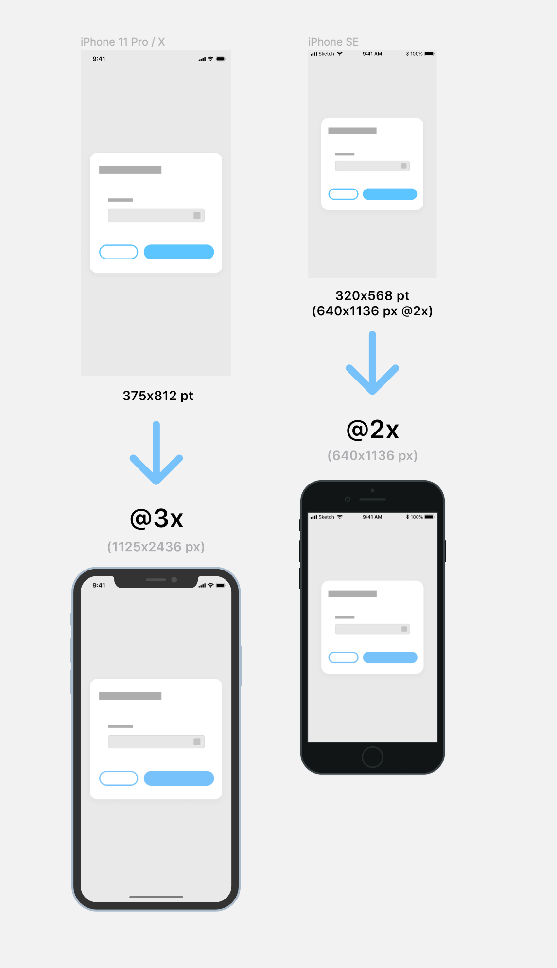
Most mobile devices today operate on a multiplier format where you have a design and it would scale itself up to 1-3x to fit the screen area you’re using.
or example, iPhone resolution is in the multiplier format (1x,2x,3x) so what matters is that you set your screen ratio according to your viewing devices to align with the screen you’re doing. The iPhone Max frame preset in Figma is 414 x 896 px while it actually displays on 2688 x 1242 px. So Divide it with a calculator and it reads 3x so keep in mind that everything you do in Figma will be enlarged 3 times than its actual pixels. When designing, consider how elements might look at a lower resolution to ensure clarity and performance.
Remember that doing the designs on the actual resolution is not recommended because the dev has to input 1x numbers when they implement a design and you’ll be giving them 3x sizing if you manually scale the default Figma frame preset to reflect the actual iPhone 11 Pro Max resolution (2688 x 1242 px).
Usually in a project team, native app developers will either:
Control the padding amount 'around' your button, and let the actual width of the button bg (or touch area) itself stretch along with the container, or
Control the width of the button and let the padding adjust according to the target screen
They will have to input the 1x numbers and the developer tools will scale the actual pixels for them. If you want to double the resolution, you will need to adjust the scaling settings accordingly. (3x on iPhone Max series and so on)
Multiple sizes should convey the same message throughout
Like how you order your layers or name components, there is some legroom to interpret a design into production. Make sure you communicate your design clearly with developers and you might learn a thing or two about how they operate and code out your beautiful designs.
I'm a full-time Product Designer (and a Front-end enthusiast) at OOZOU in Bangkok, Thailand
Share:
Join the conversation
Comments
orhan
December 2nd, 2022
Can you post a figma design file into ios app store, also how do you make it where when someone downloads your app on app store it fits their specific resolution


 orhan
orhan