Simple Tweaks That Could Help Brighten Up Your User Flow Presentation
Concise communication is vital in making or breaking your ideas. Treat them like you would your typical design pitch.
Show, Don’t Tell.
Many think that to be more clear about something; they would need to be more comprehensive and provide an even more detailed explanation for the subject. That is not the case when it comes to pitching and presentation. It is preferable to create a compelling visual rather than to phrase those into a wall of texts.
Don’t be afraid to use diagrams and other visualisation methods to get your point across.
Know Your Audience
When you’re building a user flow, consider your stakeholders’ design literacy: the ability for them to understand wireframes, design conventions, interactions, backend logic, etc.
Build empathy with their field of work and adapt your user flow diagram (and your presentation style) accordingly. Start from high-level user flow for management or marketing side -- then transform those simple charts into wireframes and eventually UI screens.
Pick The Right Tool For The Job
Use software that is easy for you (and your team) to operate. At OOZOU, we use Overflow for our diagram presenter and signoff point.
Using Overflow allows us to rapidly iterate on each user journey and carry out our ideas to stakeholders.
- We can easily import and link our design screens from Figma directly.
- Link sharing with version control is supported: you can put up each version of the file as the source of truth.
- Inline comments and prototyping views allow for feedback collection.
Rely More On Visual Hierarchy
Consider using these aspects to focus, prioritise, guide, and disassemble your ideas:
- Size -> Adjusting the scale of some objects can increase or reduce the attention it gets.
- Colour -> Viewers can differentiate between a set of colours and form their mental models to categorise different topics.
- Contrast -> Use dimmed out texts to direct users into a more prominent message nearby is also a good trick.
- Alignment -> Arrange your presentation in a neatly organised pattern to give your audience a sense of direction.
- Repetition -> something different can stand out even more when you intentionally break repetitive elements with it.
- Density -> Make sure you create enough negative space for your work to “breath” so your audience won’t be overwhelmed by irrelevant information.
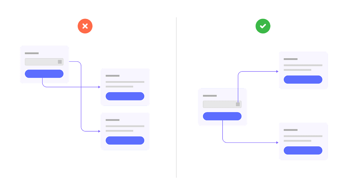
Do’s and Don’ts
- Avoid creating a maze which confuses viewers. Reorganise flows to minimize overlapped connectors. Doing so will help declutter most of your screen and help emphasise visual relationships.
- Use colours to group elements -- create some simple rules for colours and stick to them—E.g. Red for error screens, blue for common use cases, purple for authentication flow, etc.
- Use short keywords as an explanation. A review session is often necessary to carry ideas across to all stakeholders when working on a meeting-intensive project. Try using only keywords and short descriptions to keep your audience engaged and worry less about reading what’s on the screen.
- Prepare to send out the link after finishing your presentation. In this day and age where video conferencing is preferable, sending out a link of your presentation or user flow diagram beforehand is not recommended: without your context and explanation, these diagrams can potentially distract stakeholders. Use screen sharing options for these types of sessions to ensure you can effectively facilitate the meeting.