Three Things to Keep in Mind for Naming Conventions of Your Design System
Up your slash game by following these simple guidelines
The highly-anticipated updates to Figma would introduce a new way of interacting with multiple states of a component – dubbed variants – by grouping your components into multiple states divided by a slash ( / ). Incorporating user-centered design principles ensures that your naming conventions align with the needs and expectations of your users.
The design thinking process is a crucial framework in UX design that helps define user needs and develop solutions through stages like inspiration and conceptualization.
Or if you’re starting on UI design and want to prepare for larger-scale projects (where you are not the only one working on a file,) here are the basics:
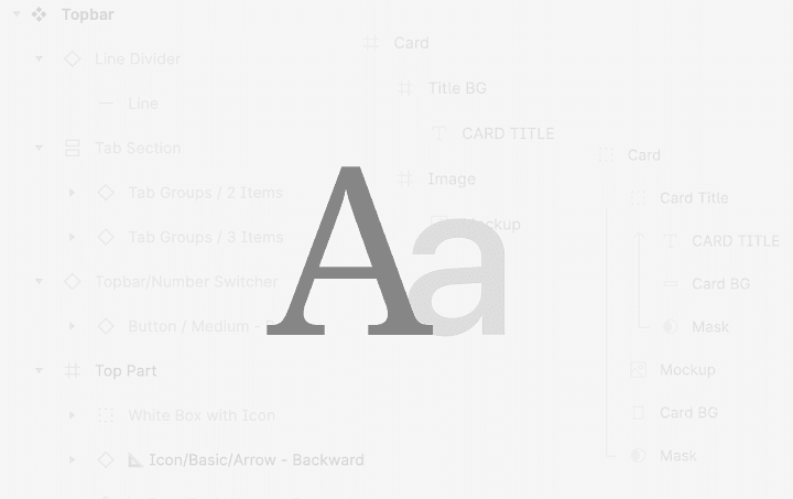
1. Recognisable name
There’s no need to divide text sizes by H1 - H6 or change ‘popup’ into ‘panel’ if your team is unfamiliar with it. Limiting your design system into development’s terms is somehow putting beginners and non-technical designers into a steep learning curve and could overwhelm them from adopting your design system. Suppose your team is comfortable with ‘Normal, Header, Super, Uber’ then, by all means, go for it. Conducting user research can help determine which naming conventions are most intuitive and effective for your team.
Consult the ‘good’ design system examples on the web to get started
It is also quite useful to quickly compile your own team’s Component Wiki or Cheat Sheet outlining common and recommended names (or in this case: per client project). Everyone could then catch up on your common naming and search for what they want when needed.
Tip: If you’re working with front-end developers, you could also ask them to give you access to their UI system tools (Storybook for example) so you could borrow familiar names for both design and development teams.
2. Manageable Properties
Like adjectives in English, properties have to represent themselves in a certain way for them to be easily accessible. Try naming simple elements using these quick templates:
[Name] / [Type] / [Size] / [Colour] / [State]
Effective interaction design ensures that properties, including those in the user interface, are named in a way that enhances usability and accessibility. Contrary to adjectives in English, remember to keep these properties interchangeable. Preview it on your ‘working file’ to optimize it for better accessibility. For example, in Figma, you would need to group some properties to have them present all options in the same folder. This way, designers would have an easier time previewing and selecting overrides for each element.
Interchangeable components should keep scalability in mind. If you’re building it right, there should be no problem further expanding the naming convention down the line, even though the UI structure would become more complicated.
Remember that the perfect design system doesn’t exist; everything can be progressively revamped, redesigned and improved.
3. Established Case Rules
The next best item for your teammates is consistency in helping them navigate through the treacherous terrains of your (perhaps) half-baked labyrinth of a design system. Having an organisation-wide ruleset for naming stuff could be a big help for everyone.
The UX design process serves as a structured framework that guides the creation and validation of naming conventions.
Conducting usability testing can help validate that your naming conventions are clear and effective for all team members.
Create guidelines for your naming conventions. Revise them frequently. Let everyone know that in order to be well-organised, you need contributions from the team to keep an eye out for rough edges so that the guidelines are kept neat and tidy. It’s preferable to have a standard naming convention ruleset from the start and have everyone comply.
There’s no point in having a Title case naming on one project and Camel case on another.
For our team, we prefer to use Title case naming convention with one spacebar gap before and after a slash (Name / Property 1 / Property 2 / … ) as it is easier to eyeball and maintains comfortable breathing room within a layered list.
4. Scalable Structure
A scalable naming structure is crucial for accommodating the growth and evolution of your design system. As your design system expands to include new components, states, and variations, it’s essential to maintain a consistent and logical naming convention that can easily adapt to these changes. By implementing a scalable structure, you ensure that the design system remains organized and manageable, even as it becomes more complex.
It's also important to adapt naming conventions for different types of user interfaces, including voice user interfaces, to ensure they are user-friendly and accessible.
To achieve scalability, consider using a hierarchical naming system that categorizes elements based on their function, type, and state. This approach allows for easy identification and retrieval of components, streamlining the design process and enhancing collaboration among team members. Additionally, regularly review and update your naming conventions to align with the latest design trends and technological advancements.
5. Consistent Documentation
Consistent documentation is key to maintaining an effective design system. By providing clear and comprehensive guidelines for naming conventions, including a UX designer's responsibilities in conducting research, designing wireframes, and advocating for users' needs, you enable team members to quickly understand and adopt the system, reducing the learning curve and minimizing errors. Documentation should be easily accessible and regularly updated to reflect any changes or additions to the design system.
Include examples of common naming patterns and best practices, as well as explanations of the rationale behind certain naming choices. This helps ensure that all team members, from UX designers to developers, are on the same page and can work together seamlessly. Encourage feedback and suggestions from the team to continuously improve the documentation and address any potential issues or areas of confusion.
6. Adapting to Technological Advancements
As technology evolves, so too should your design system’s naming conventions. With the rise of augmented reality, mobile apps, and other emerging technologies, it’s important for UX designers to stay ahead of the curve and adapt their naming strategies accordingly. While 'ux design require coding' is not mandatory, understanding coding can help in adapting naming conventions to new technologies. This forward-thinking approach ensures that the design system remains relevant and effective in a rapidly changing digital landscape.
By incorporating modern industry tools and prototyping tools into the design process, designers can better align their naming conventions with current technological trends. This not only enhances the system’s scalability but also prepares it for future advancements in human-computer interaction and interactive systems.
7. Encouraging Collaboration and Communication
A successful design system thrives on collaboration and open communication among team members, with the UX designer playing a key role in encouraging effective naming conventions. Encourage UI designers, graphic designers, and interaction designers to share insights and suggestions regarding naming conventions. This collaborative effort fosters a culture of continuous improvement and innovation, ultimately leading to a more cohesive and effective design system.
Regular team meetings and workshops can be valuable opportunities for discussing naming strategies and gathering input from diverse perspectives. By involving all stakeholders in the decision-making process, the design system becomes a collective effort that benefits from the collective expertise of the entire team.
Frequently Asked Questions (FAQs)
**Q: What is the difference between UX and UI design?**A: UX design focuses on the overall user’s experience, including usability, accessibility, and satisfaction, while UI design is concerned with the visual elements and interactive components of a product.
**Q: Do UX designers require coding skills?**A: While coding is not a mandatory skill for UX designers, having a basic understanding of coding can be beneficial in collaborating with developers and understanding the technical aspects of the design process. UX design require coding knowledge to enhance collaboration and facilitate the design process, but the primary focus remains on tasks such as research, prototyping, and user testing.
**Q: How do UX designers gather user feedback?**A: UX designers use various methods such as user testing, surveys, interviews, and usability tests to gather user feedback and insights to improve the design.
**Q: What are the key UX design skills?**A: Key UX design skills include user research, information architecture, interaction design, visual design, and prototyping, among others.
**Q: How can a design system improve user satisfaction?**A: A well-organized design system enhances user satisfaction by providing a consistent and intuitive user experience, reducing confusion, and ensuring that the product meets user needs and expectations.