Welcome to the UX Myth blog series, where I debunk common design misunderstandings you keep hearing about in product meetings (and attempting to fix them).
Fit Everything On Top or “Above The Fold”
The term “Above the fold” derives from the way a newspaper is physically folded together. Editors highly regarded these areas as the main hero for enticing readers. Any topic that could interest them would be put in these areas, aiming to grab as much attention as possible when walking past the newsstand. In web design, above the fold content is crucial for user engagement and SEO performance, as it needs to be visually appealing and functional to capture user attention and drive conversions.
The notion continues to be the most common assumptions among marketers until the era of Adobe Flash websites (Yes, it exists). Everything worthwhile and, excuse the pun, flashy, used to take up the entire screen area. All transitions on a web page would act like a PowerPoint presentation where you navigate around using chevron (< >) and arrow keys (< - ->). The fold content is critical for engaging users and influencing key metrics like click-through and conversion rates.
Scrolling used to be regarded for long texts because a scroll wheel mice were not that popular back in the day. Well, that is, right up until the responsive website came into view.
Is This Myth Still Relevant Today?
Hopefully no. There are many common assumptions that users may not know that the page is scrollable. One theory that stems from my observations is that people with less contextual awareness would only look at a prototype imagining it was on printed paper. Hence the subconscious tendency to compress everything into a single screen. However, below the fold content can still be relevant and user-friendly if designed thoughtfully.
So no, users did scroll. They have done that instinctively for a while now. The problem is that the expectation is that we would miss out on engagement and awareness if we “hide” that content below the fold. It turns out that is still far from the truth. In fact, content that is below the fold plays a crucial role in user engagement and revenue generation.
Having to put everything into a top area of the page could also hurt your engagement. There are multiple studies regarding the banner blindness phenomenon where the audience became desensitised from full hero images and tended to ignore it without receiving any message whatsoever —or even being blinded to the sheer amount of ads banner altogether.
What To Do?
There are numerous UX suggestions and tips that are usually brought up to help demystify this assumption.
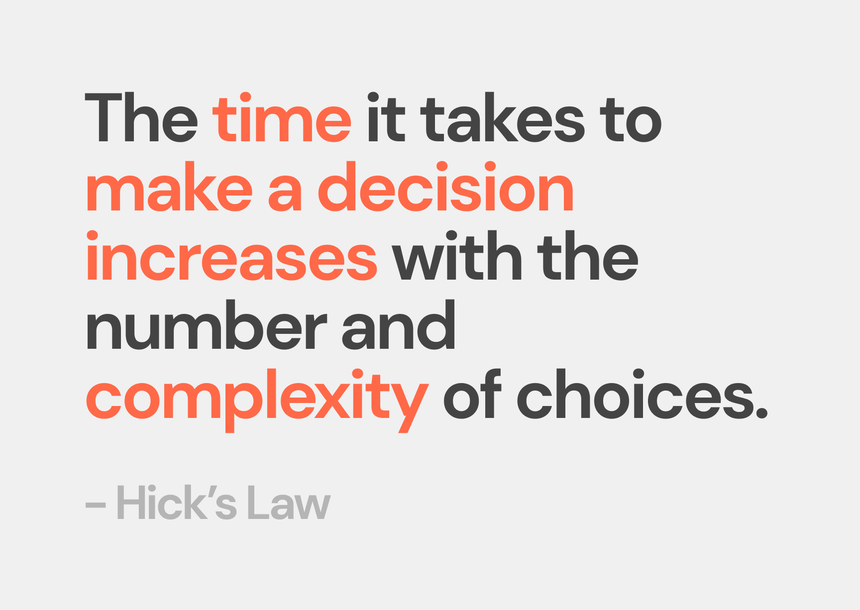
For example, the top part of the website might need to be focusing on maximising conversion. Above the fold is crucial for user engagement and business objectives, as it prioritizes visibility and interaction. It would need to utilise the Hick’s Law principle – Create a better Signal-to-Noise ratio and not overwhelm your users, focusing on a single primary element at a time, e.g. Call to Action, Promotional banner, best items in the store, etc.
Let’s Say We’re Building A Marketing Page For A Product
The example I could use is to imagine directing a movie.
You could build up towards a climax and wind it down, or you could start in the end and spend a little more space on building that narrative back up and strengthening your claims at the beginning.
In web design and content strategy, it is crucial to consider what is below the fold—the area of a web page that users cannot see without scrolling down. This space is significant for planning webpage content and call-to-action placements.
You would need to have a proper amount of dialogue (with users), let the content breathe, and keep them engaged through the entire thing using proximity and negative spaces. You won’t fit all that in one page, so just let users do the scrolling.
The Compromise
There has been much usability research conducted to find the middle ground between these conflicting notions. Understanding the fold is essential in web design, as it highlights the content that appears above the fold as critical for user engagement and visibility. One of Huge’s article states that all of their test users, despite being 94% sure that they can scroll the content, still reacted positively with an arrow icon signalling that the page is not finished and that they could scroll down accordingly.
So there you go. If you’re still unsure about your user’s scrolling behaviour, try to spread out those contents and put scrolling indicators as a cherry on top.
Your users will thank you.

Ready to start your project? Contact Us
