Welcome to the UX Myth blog series, where I debunk common design misunderstandings you keep hearing about in product meetings (and attempting to fix them).
What Is White/Negative Space?
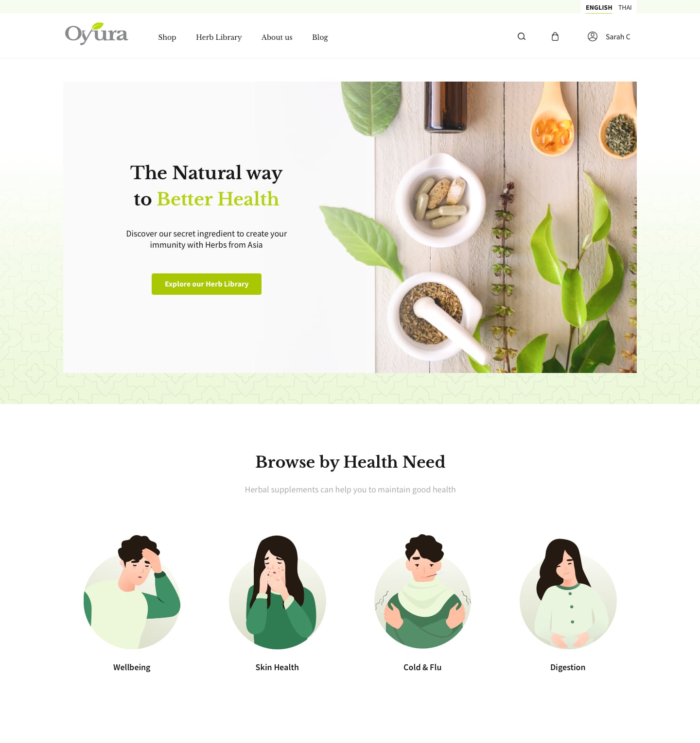
When creating any designs, most would resort to these spaces as “breathable spaces” where you intentionally leave out areas within the layout to signify the separation between contents.
The problem is, we are not used to this level of emptiness before.
The Human Adaptation For The Draught Of Spaces
As for all design-related subjects, people perceive “emptiness” differently. Most people born from the pre-digital era mostly have everything in one, simple, carry-able space -- a “TV Remote” solution -- where every available input and the user interface is put together in such a small confined slab of plastic.

This UI control method streamlines the manufacturing process and increases portability -- thus simplified the ability to physically “hold” the interface in their hands.
Same with writings and paper-based content, we resort to using glasses for magnification. We prefer to hold it closer to our face than enlarging the object’s physical sizes -- these “workarounds” resulting in something that you can have in your hands. In contrast, its contents are being squished together for maximum usability.
Because the screen is the reincarnation of digital paper, having these incomprehensible empty spaces on those might not play well with our trained space-conscious brains. We did have to scroll a lot to find what we wanted, which is worse than standing still and look closely at it, right?
The Benefit Of Negative Spaces In Designs
- Content Feels More Powerful
You wouldn’t be comfortable when someone went through 40 slides of information in 40 seconds and expect you to keep up. Most impactful sessions happen when you can keep up with the pace of the speaker. They give you room to think and reflect on what’s being presented, keep reinforcing your beliefs, are firm and exert confidence in what they’re saying.
Creating convincing and meaningful designs keeps your target users engaged and intrigued during the time they’re using your product. Saying one crucial message and leaving out 20 unimportant ones should be your main priority, not the opposite.
- You (And Your Users) Spend Less Time On Unimportant Stuff
Imagine planning for a 2-hour blockbuster movie, only to get an executive order extending it into a TV series with 12 episodes. You and your team would hate it, and viewers wouldn’t like it either -- The movie will become bloated and become a waste of everyone’s time.
Creating more content takes effort, even more so with filler content that serves no purpose than filling up spaces and making the design look busy for no good reason.
- Less Options = More Manageable Results
You might be familiar with the tale of “Having too long and too many distractions in a checkout process will increase bailout rate” from most e-commerce websites.
Expect users to have a low tolerance for irrelevant information that could hinder their decision-making ability.
One of Hick’s laws’ essential aspects is not to overwhelm users by bombarding them with content and decisions. It’s better to provide users only a few quality decisions worth everyone’s time rather than shower them with mountains of options and decisions and have them abandon the decision process altogether.
What To Do?
On the initial stage of art direction and design system planning, try reviewing and performing a five second testing between alternatives versions of your designs and see how they interact with it. Research shows that negative spaces improve readability and increase your users’ engagement rates and decrease the rate of skim-reading: they spend less time finding what they wanted and get to it faster than squinting over your poorly spaced layouts.
Thus, having more breathing room between a chunk of content may improve usability and get your users where they wanted easier. Make sure you adhere to the visual hierarchy principle to increase a user’s ability to skim your content as well.
Thus, having more breathing room between a chunk of content may improve usability and get your users where they wanted easier. Make sure you adhere to the visual hierarchy principle to increase a user’s ability to skim your content as well.
Remember to always communicate with your stakeholders and leave out those biased in having “more” white spaces to fit your aesthetic choices. You are there to make it work for your users, after all.


Ready to start your project? Contact Us


