Welcome to the UX Myth blog series, where I debunk common design misunderstandings you keep hearing about in product meetings (and attempting to fix them).
Misconception About Font Size
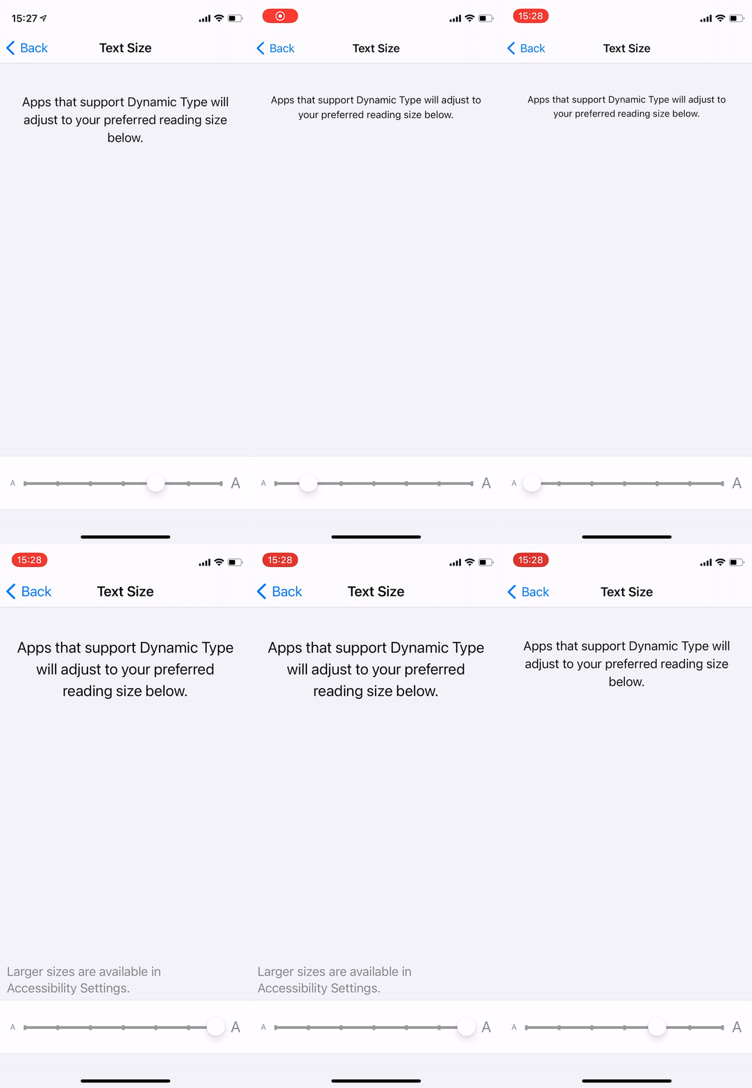
The general public’s common perception would be that apps with smaller text sizes aim more towards a younger user base and the larger ones are for the exact opposite audience. The notion gained its roots by these stakeholders “looking over the shoulders” of people using other apps or browsing websites they’ve never used. Little did they know that those users expressly set up the phones to have a specific text sizing according to their preference.
Both iOS and Android smartphones have accessibility features that can shrink or enlarge fonts baked right into their Operating System. These features begin to mislead some people into assuming that all app developers can only use the exact font sizes across all devices, which is not always true.
“Like many things in UI design, something that appears random and subjective (like font sizes) is depending on a remarkably sensible principle: we like to read paragraphs whose letters are about the same subjective size – namely, something like 0.3° tall, from baseline to cap height, in our field of vision.” - Erik D. Kennedy.
Friction Between Designers And Stakeholders
Imagine being stakeholders who are not as tech-savvy as you. They’re probably using phones without knowing much about their functionality and its behind-the-scenes process.
Chances are when you, as a designer working how many years in this industry, share your beautifully hand-crafted screens for your stakeholders to see in a review session -- This is what happens:
- They’re looking at those designs via a browser window on their 14-inch screen laptop or less -- resulting in much smaller UI elements than you intended.
- They might put your preview next to a real app, which already has manually enlarged texts.
- They’re not aware of the dynamic font size functionality on both iOS and Android.
All of which leads to overly small and disproportionately sized UI elements, which feeds into this vicious cycle of over-enlarging font size for the sake of readability.
To alleviate this, let’s first understand more about how developers implement designs (especially texts) into the actual product -- using dynamic type sizing guidelines.
Font Sizing Has Changed
iPhone and Android both developed their first-party ecosystem to help developers deal with screen sizes fragmentation.
Dynamic type for iOS and The Type System for Android provide comprehensive documentation and best practices by letting developers modify the preferred sizes of typefaces and create a set of “multipliers” for each text content element. These guidelines tell how larger the texts will need to be to maintain standards and support all users who may have to globally enlarge or shrink their default font sizing across their phones beforehand.
Why? To ensure that every app following these guides can retain the best user experience across all applications used within their phone.
I would recommend a simple explanation for these practices from Learn UI Design Blog for those who want to know more about the principle of digital typography.
Sure, some concerns about “users don’t know how to increase font size” may lead to a request to force a particular sizing of texts. These “forced font size” implementations take even more time than usual and will fall apart when we reach into a more prominent issue: screen size fragmentations.
What To Do?
- Inform and educate all stakeholders involved in the project to be aware of modern development methods such as Dynamic Type Sizes, guideline, best practice, etc., as there are plenty of resources you can look up.
- Create a quick prototype test case with smaller or larger devices and compare them with other apps on the market.
- Avoid feedback trap that leads to personal bias from asymmetric comparison, e.g. “Our hero header in an-iPhone-Xs-Max-size mockup looks so small compared to an “enlarged” body text on Samsung s20.” and so on.

Ready to start your project? Contact Us

